AI Styling Strategies for Viral Food Content
Introduction: Why Some Food Posts Explode and Others Stall
It’s Tuesday morning. Your birria ramen drops on Friday. The photographer you like is booked for two weeks, and the last iPhone shot you posted got polite likes but no comments or saves. The dishes are great-so why isn’t the content working?
Viral food posts aren’t random. They repeat the same visual mechanics. These include directional light that makes sauces glow, tight compositions that fill the screen, and color pairings that make the hero ingredient pop. Once you know the patterns, you can reproduce them with AI food photography without staging a full shoot.
This article reverse-engineers those patterns into simple formulas you can run with AI food photography. We’ll break down lighting (angles, ratios, Kelvin temps), composition (angles, crops, negative space), and color psychology (warm comfort vs neon novelty). Then we’ll show how to encode each formula inside Yummify so you can generate on-brand images in minutes-perfect for menus, Instagram, or delivery apps. Expect specificity: step-by-step settings, realistic examples, and prompts you can copy. If you can take a halfway decent reference photo-or even just describe your dish-you can produce the look your audience already responds to. This works faster and for a fraction of a traditional shoot’s cost and lead time.
Summary: We set up a relatable timeline crunch and promise specific, repeatable formulas for lighting, composition, and color-implemented in Yummify.
The Mechanics of Virality: Light, Composition, Color That Stop the Scroll
Lighting that sells food
- Use a 2:1 key-to-fill ratio to create soft shadows that define texture without looking harsh. A 45? back-left key light makes cheese, glazes, and broths gloss up; a small fill on the front right keeps shadows from going muddy. For warm comfort foods (pizza, ramen, stews), target 3000-3500K. This AI food photography technique delivers consistent results across your menu.
- For crisp fried foods, add a subtle rim light (15-20% intensity) from behind to outline edges. This separates a fried chicken thigh from a dark background and reads as “crunch” in a still frame.
Composition that maximizes screen real estate
- On Instagram, 4:5 vertical is ~25% taller than a square, occupying more feed height. A 3/4 angle (camera 35-45? above the table) shows height, sauces, and layers in one shot-great for burgers and bowls. When you optimize food composition for social media, macro 1:1 crops with 30% negative space work for close-ups of frosting, crumb, or grill marks.
- Rule of odds: 3 tacos look fuller and more intentional than 2. Use a diagonal hero line (e.g., from bottom-left to top-right) to guide the eye through the scene.
Color psychology that triggers cravings
- Warm palette (amber/gold/red) = comfort and indulgence. Cool palette (teal/blue) = fresh, crisp, modern. Pair complements: a golden burger on a desaturated teal surface makes the patty look richer via simultaneous contrast.
- Practical example: A Nashville hot chicken sandwich shot at 3200K with a muted teal (#2AA7B8) backdrop consistently reads spicier and juicier than the same sandwich on a beige table. Another example: Matcha soft-serve on light pink (#F7C1CC) feels playful and shareable. Compare this to white-on-white, which often looks clinical.
Practical takeaway: pick one light recipe (2:1, 45? back-left), one composition (4:5 at 3/4 angle), and one complementary background color per dish. Encode them once; reuse across your menu.
Summary: The section pins down the three levers-light, composition, color-with precise ratios, angles, and color pairings that can be reused.
Copy These Viral Archetypes: 3 Ready-to-Use Styling Formulas
Below are three proven looks you see across viral feeds. These viral food content patterns work because they use established visual psychology. Each includes a plain-English formula and how to reproduce it in Yummify.
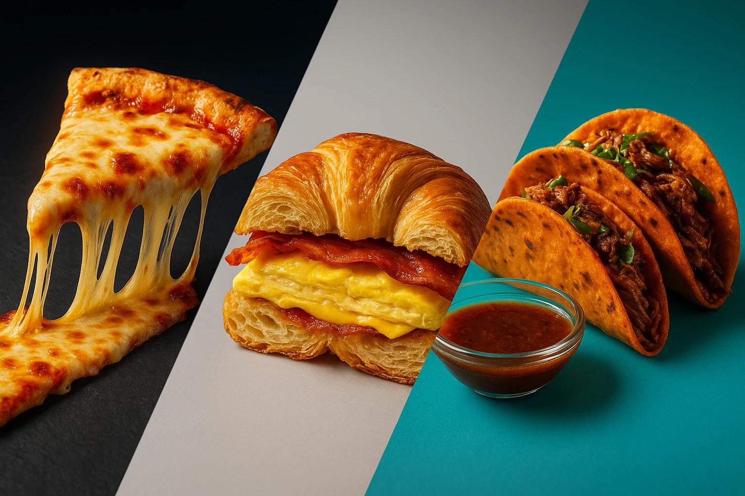
1) Cheese Pull Hero (melty, glossy, indulgent)
- Lighting: 45? back-left key at 3200-3400K, fill at 50%, subtle rim at 15%. Aim for specular highlights along cheese strands.
- Composition: 3/4 angle, 4:5 crop, hero line following the pull. Keep props minimal; use a dark slate or charcoal surface for contrast.
- Color: Warm golds/oranges (#F5A623 to #FDBA74) against muted teal (#2AA7B8) or cool gray.
- Yummify formula: “Cheese pull pizza slice, 3/4 angle, 4:5 crop, 2:1 key-fill, back-left key 3300K, subtle rim, dark slate surface, muted teal backdrop, minimal props.” Save this as Branded Environment: Melt & Gloss.
2) Cross-Section Crumb (layers and structure)
- Lighting: Side key at 5600K to emphasize layers; fill at 30% to keep shadows crisp. Slight harder light is fine-texture loves contrast.
- Composition: Macro 1:1 crop; focus on cut edge. 30% negative space behind. Neutral surface (light gray) prevents color cast.
- Color: Keep background cool-neutral so pastry/bread tones stay accurate.
- Yummify formula: “Croissant breakfast sandwich cross-section, macro 1:1, side light 5600K, 3:1 contrast, neutral gray surface, 30% negative space.” Save as Branded Environment: Crumb Lab.
3) Saucy Dip Glow (broths and consommes that look radiant)
- Lighting: Strong backlight (60-70% intensity) through the liquid. Add a small front fill (20-30%) to reveal the rim. Use 3200-3800K for deep reds.
- Composition: 3/4 angle; hands optional but keep to one hand if needed. Keep the bowl centered with the dip cup slightly forward.
- Color: Deep red/orange broth against a cool blue/green surface (#0EA5E9 or #1FAA9B) makes the liquid glow.
- Yummify formula: “Birria taco dip, 3/4 angle, strong backlight 70%, front fill 25%, 3500K, cool blue surface, steam visible.” Save as Branded Environment: Glow & Dip.
Tip: generate 3-5 variations per archetype at standard quality, shortlist winners, then upgrade only the top performers using Quality Upgrades.
Summary: Three archetypes with lighting ratios, crops, hex codes, and copy-paste Yummify formulas you can turn into reusable Branded Environments.

From Idea to Image in Minutes: Your Yummify Workflow
Here’s a practical path from concept to publish without a studio day. This food photography workflow transforms your content production speed.
Step-by-step
- Start with a reference or text. Snap your dish near a window (avoid mixed lighting). Or just describe it: “double-smash burger with caramelized onions and cheddar, sesame bun.”
- Apply Prompt Enhancement. Yummify expands your basic description into a detailed styling brief, adding lensing, angles, and material cues you can tweak.
- Choose or create a Branded Environment. Encode your formula once: lighting (e.g., 2:1 ratio, 3300K, back-left), composition (4:5 at 3/4), surfaces (dark slate), and color accents (muted teal). Name it (e.g., Melt & Gloss).
- Generate 3-5 variants per dish at standard quality. This takes minutes. Use different camera angles (3/4 vs overhead) within the same environment for coverage.
- Pick winners and upgrade selectively. Use Quality Upgrades to take only your best images to higher resolution for menus or delivery apps.
- Rinse and reuse. Apply the same environment to your whole category (e.g., all melts and pizzas) for consistent identity across Instagram, your website, and DoorDash.
Two quick examples:
- Seasonal menu sprint: 12 dishes in one afternoon. Traditional route: $3,000-$6,000 and 2-4 weeks for a 20-dish shoot. With Yummify, create two environments (Rustic Cantina for mains, Crumb Lab for desserts) and publish same day.
- Ghost kitchen: No dining room? Upload basic reference shots, then style them into a cohesive “Neon Night Market” look-no studio rental needed.
Summary: Concrete workflow from prompt to publish, with realistic timelines and how to use Branded Environments and Quality Upgrades to move fast.
Real-World Results: Pizzeria Deep Dive + 2 Quick Wins
Deep dive (hypothetical but realistic)
Local pizzeria “South Street Pie” tested three styles for their DoorDash hero image over 14 days:
- A) Overhead square on wooden table (control)
- B) Cheese Pull Hero (Melt & Gloss environment)
- C) Cross-Section Crumb (slice cross-section macro)
Results: Versions B and C ran for 7 days each. B produced a +18% higher click-through versus control; C was +9%. With 1,200 weekly menu impressions and an 8% baseline CTR, B added ~173 extra clicks/week. If 5% of those clicks convert and the average order is $22, that’s ~9 extra orders/week. This equals +$198 gross. The AI food photography results speak for themselves.
Mechanism: The 4:5 crop occupied ~25% more screen height. The warm backlight at 3300K amplified cheese gloss. These food lighting techniques create appetite appeal that converts viewers. The teal surface provided complementary contrast to the crust’s warm tones-elements validated across high-performing posts.
Quick wins
- Ghost kitchen tacos: Built “Glow & Dip” environment (70% backlight, 3500K, cool blue surface). Over a month, Instagram saves per taco post climbed from a 3-week average of 42 to 98 (hypothetical). Meanwhile, content production time dropped from ~45 minutes editing to ~6 minutes generation.
- Agency pitch: For a 12-location taco chain, the agency generated 15 style directions (bright & bold, dark & moody, minimal & clean) in one afternoon. Client selected two; the agency then produced 30 final images. This would have been infeasible with a traditional pre-pitch shoot under the budget and timeline.
Takeaway: small percentage lifts compound. Even +5% on a delivery funnel at 800-1,200 weekly impressions adds meaningful orders, and you can test styling changes within a day.
Summary: Numbers-backed case study plus two quick examples show how small styling shifts translate into measurable outcomes without a studio.
Implementation Guide: Your First 7 Days + Mistakes to Avoid
Your first 7 days
- Day 1: Pick 2 dishes and one look. Example for comfort foods: 2:1 light ratio, 3300K, 3/4 angle, 4:5 crop, dark slate surface, muted teal backdrop (#2AA7B8).
- Day 2: Build a Branded Environment in Yummify with those parameters. Name it and save.
- Day 3: Generate 3 variants per dish at standard quality. Keep one constant (lighting) and test one variable (angle or surface).
- Day 4: Post variant A vs B on Instagram Stories and rotate on your delivery app listing for 48 hours each. Track clicks/orders.
- Day 5: Upgrade the top image. Swap it into your website menu and delivery app.
- Days 6-7: Clone the environment for a second category (e.g., dessert) with adjusted settings: side light 5600K, neutral gray surface, macro crop.
Common mistakes and quick fixes
- Mixed lighting casts (window + overhead): set one color temp. If your reference is warm, keep everything 3000-3500K.
- Too flat: increase key-to-fill contrast (from 1:1 to 2:1) or add a 15% rim.
- Messy props: limit to 1-2 items that reinforce flavor (lime, chili flakes). Keep 30% negative space.
- Wrong crop: use 4:5 for feed/menus, 1:1 macro for details.
Starter formula library
- Comfort Melts: 3300K, 2:1, 3/4 angle, 4:5, dark slate, muted teal.
- Fresh Greens: 5600K, 1.5:1, overhead, 4:5, light concrete, desaturated coral accent.
- Dark & Moody Steak: 3000K, 3:1, side light, 3/4 angle, walnut wood, charcoal backdrop.
Document your formulas inside Yummify and apply them menu-wide for consistent visuals. This AI food photography approach works well for scaling your brand presence.
Summary: A concrete 7-day plan, a formula library to copy, and fixes for the most common styling errors when generating AI food photos.
Next steps
Give yourself an hour this week: pick two menu items, create one Branded Environment in Yummify (e.g., Melt & Gloss: 3300K, 2:1 ratio, 3/4 angle, 4:5 crop, dark slate, muted teal), and generate three variants per dish. Post the best image to your delivery app and Instagram, then track clicks for 48 hours. If the winner outperforms your current image, upgrade just that file to high quality and roll the look out across the category. No studio booking, no stylist-just repeatable styling formulas you can reuse every time you launch a dish.
Continue exploring with these resources:
FAQ
Can I use my own photos as a starting point?
Yes. Upload a reference photo shot in decent light-near a window is fine. Yummify validates that the image is food and then applies your chosen styling environment. The better your input (in-focus, no mixed color temps), the better the output. If you don’t have a good photo, you can also generate from a text description alone.
Do I need special equipment to get good results?
No. A smartphone photo works if it’s in focus and evenly lit. Avoid mixed lighting (don’t combine window light with warm overheads). These simple food lighting techniques ensure better input quality. If possible, shoot on a plain surface that matches your brand colors; Yummify can handle styling, but clean inputs speed things up.
How does this compare to hiring a photographer?
Traditional shoots cost roughly $150-$300 per dish with 2-4 weeks of lead time. Yummify delivers professional AI food photography in minutes and lets you iterate cheaply. Many teams use Yummify for volume (menus, daily posts) and still hire photographers quarterly for hero campaigns-best of both worlds.
What if my food doesn’t photograph well (soups, stews, brown foods)?
Use a strong backlight and a cool-toned surface to create separation. Add a fresh garnish that signals flavor (chives, crema, sesame) and keep 30% negative space. In Yummify, try the “Glow & Dip” environment or a 70% backlight with a 25% front fill to make liquids and glazes look luminous.
How long does it take to learn Yummify?
Most users get solid results in their first session because Prompt Enhancement handles complex prompt writing. Plan 15-30 minutes to set up your first Branded Environment, then it’s reuse and tweak. Expect to generate and evaluate your first set of images in under an hour.
Can I keep visuals consistent across multiple locations or franchises?
Yes. Save your lighting, composition, and color choices as a Branded Environment and apply it to every dish. Teams in different cities can generate images that match, avoiding the “every location looks different” problem. It’s more consistent than rotating photographers with varying styles.
How do I prepare images for delivery apps and menus?
Start at standard quality to test looks, then use Quality Upgrades on winners for higher resolution. Use 4:5 vertical crops for app listings and ensure the dish fills most of the frame with clear edges. Thoughtful food composition helps app listings convert better. Keep backgrounds simple and avoid text overlays, which can be rejected by some platforms.
Related posts
15 Creative Food Photography Ideas to Make Your Dishes Stand Out
Discover creative food photography ideas to make your dishes stand out. Learn action shots, deconstructed dishes, unique angles, storytelling, and AI tools for stunning food visuals.
Beyond Burgers: AI Food Styling for Diets and Cuisines
Use AI food styling to create accurate vegan, gluten-free, halal, kosher, and global cuisine photos that convert across delivery apps, QR menus, and social.
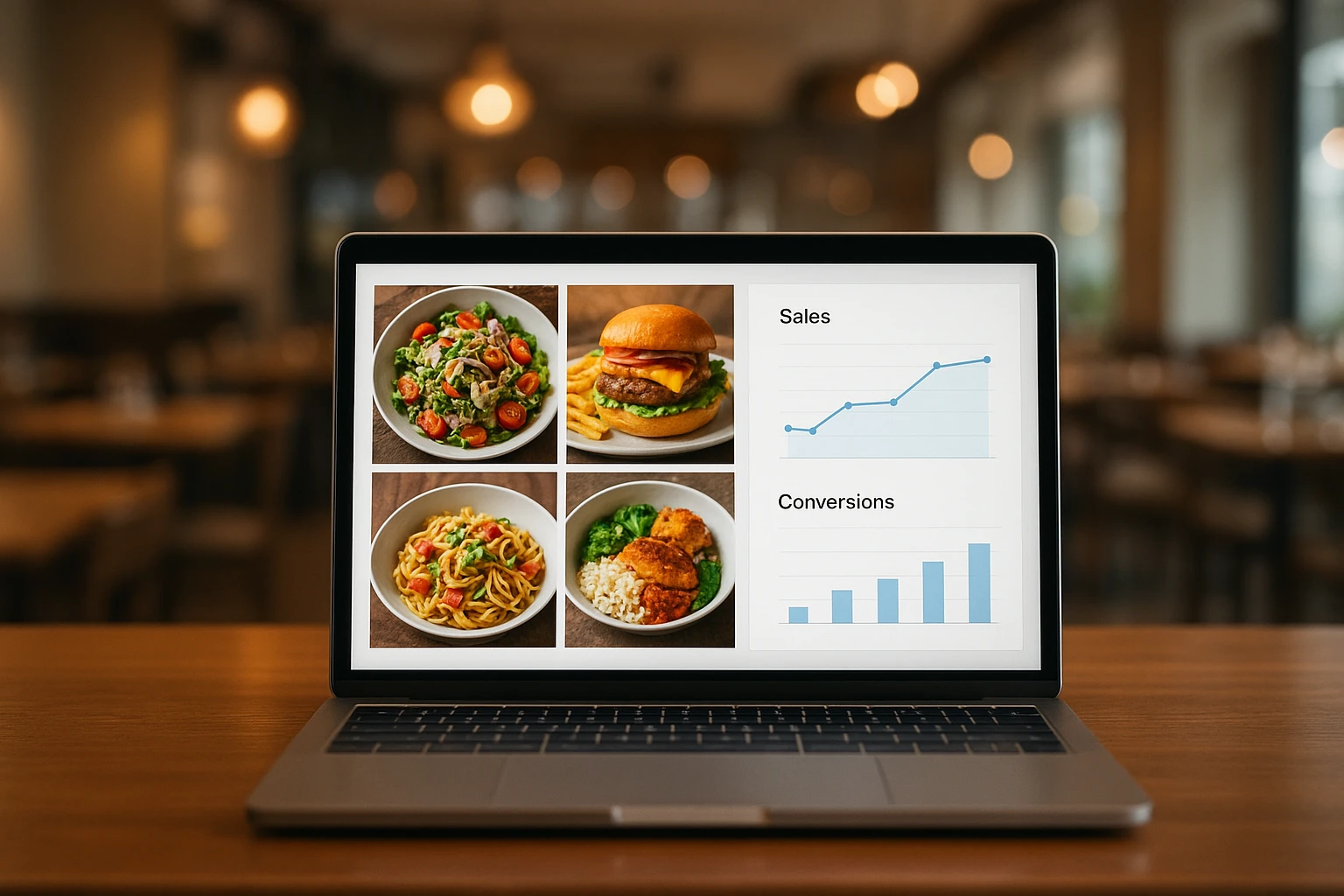
Close the Loop: Tie Food Imagery to Analytics and Sales
Stop guessing which food photos work. Learn a simple workflow to tie Yummify images to analytics, A/B test visuals, and promote only the photos that actually sell.