Close the Loop: Tie Food Imagery to Analytics and Sales
Quick navigation:
1. Why food imagery needs a data loop, not just a photoshoot
Close-the-Loop Playbook at a Glance
| Decision | Operator Shortcut |
|---|---|
| Which items should I test first? | Start with high-margin but under-ordered ‘puzzles’ from your menu engineering report. |
| What metric tells me a photo is working? | Watch add-to-cart rate and item sales lift versus a clear baseline period. |
| How long should an image test run? | Run at least 2 full business cycles (e.g., 2-4 weeks) or until you hit statistically meaningful traffic. |
| When do I roll out a winning image? | Once a variant beats baseline by a pre-set threshold (e.g., +10-15% add-to-cart). |
| How do I keep the loop closed? | Review image performance monthly; promote winners and retire underperformers in Yummify. |
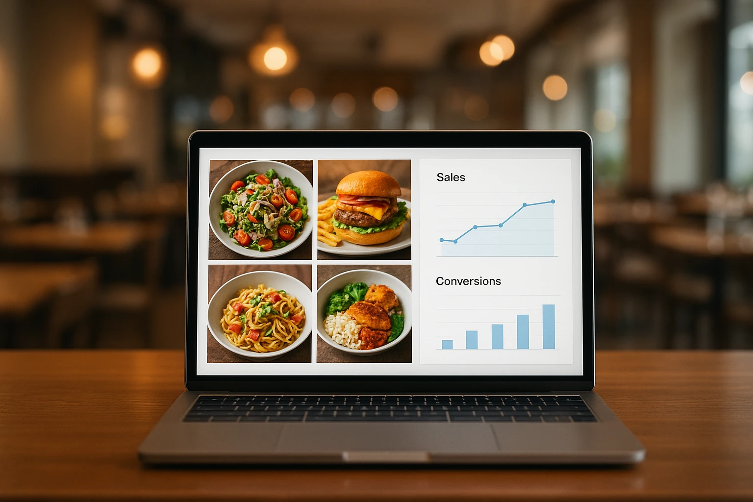
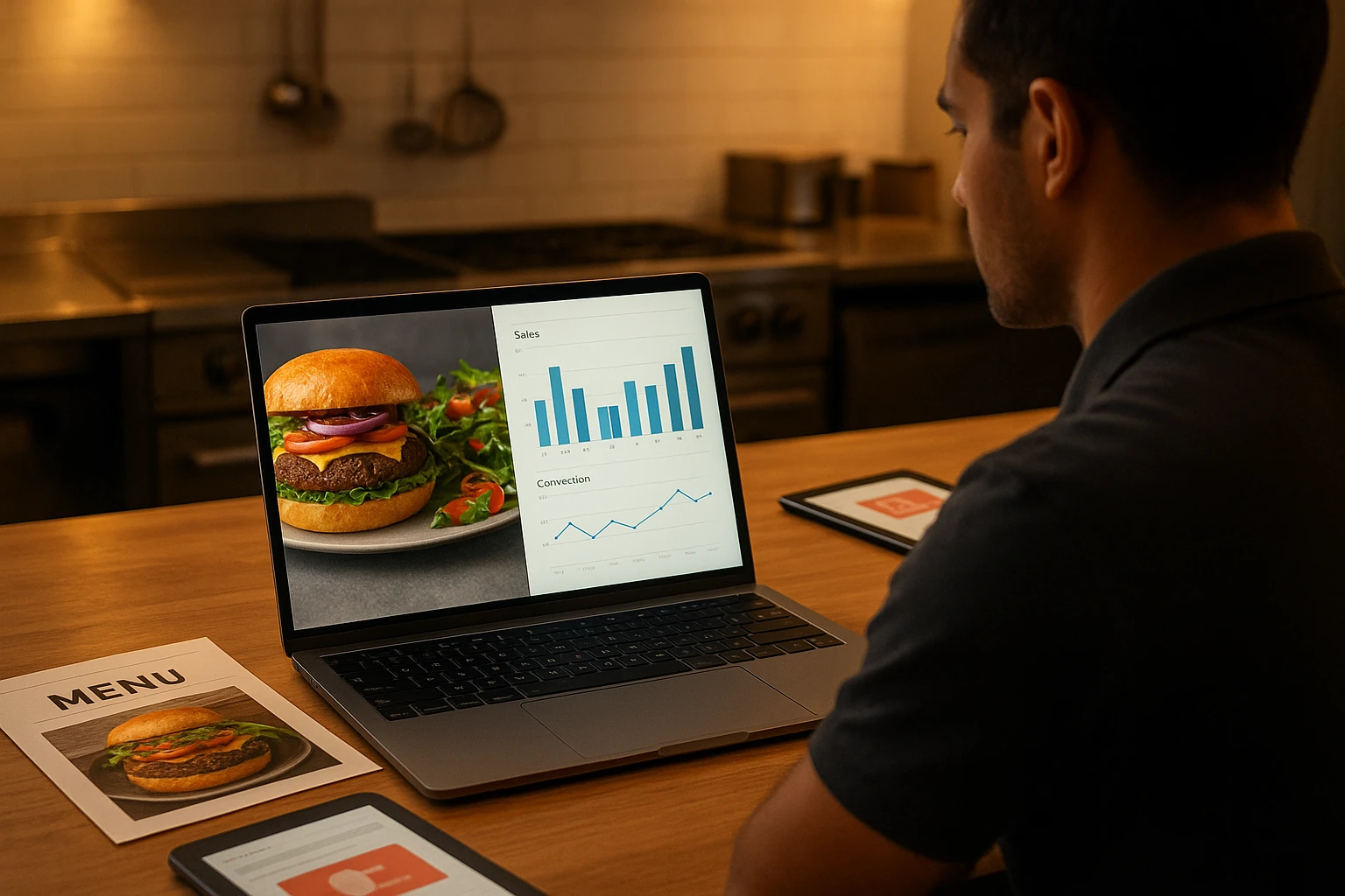
A burger chain spends a week on new AI photos. They upload. They move on. A month later, the GM can’t answer one question: did those photos sell more burgers? This is where food imagery analytics bridges the gap.
Most restaurants work this way. Big push on shoot day. Then photos sit for months. You never check if they work. This costs you:
- Lost orders. Great dishes die under bad photos.
- “Hero” images that waste space.
DoorDash reports that better photos boost sales on delivery apps. Guests decide fast from visuals. The market is tough. McKinsey notes that digital orders grew. Your online menu is now your main battleground.
From “set and forget” to a learning menu
You track pricing and item mix. Menu engineering sorts dishes into Stars, Plowhorses, Puzzles, and Dogs. Toast’s guide covers this well. Your photos need the same care through food imagery analytics.
Think of each photo as a test:
- A Puzzle needs a better photo to become a Star.
- A Star photo can show add-ons. This boosts orders.
The gap isn’t tools. You can make 3-5 photo variants per dish in minutes with Yummify. The gap is data. Without simple metrics (views, add-to-cart, sales), you can’t tell which photos work.
The National Restaurant Association says guests expect smooth digital ordering. Strong photos win attention on the “digital shelf.” NielsenIQ describes how hero images work in online grocery. These rules apply to your menu.
Treat every photo as data, not art.
Check one category on your menu now. Ask: which photos earn their spot based on real results?
2. Map your menu: a simple schema from photos to metrics
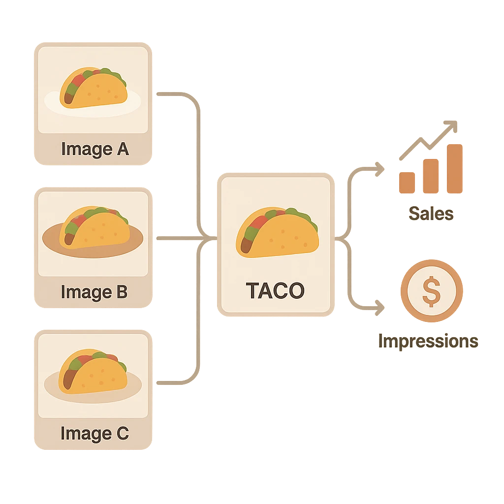
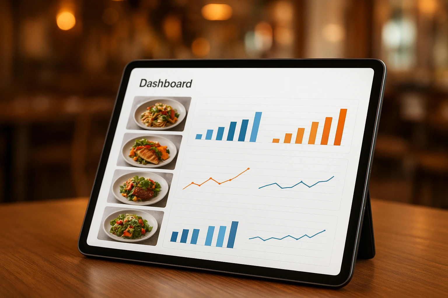
To track photos, you need to point at one image. Say: this photo, on this item, in this channel, for this time window. You don’t need a data team. You need clear names and a habit. This food imagery analytics approach works well.
Build a simple image + item schema
Give each menu item a stable ID. Match it to your POS or online ordering system. Then create photo variants under it.
Use this schema:
- Item ID:
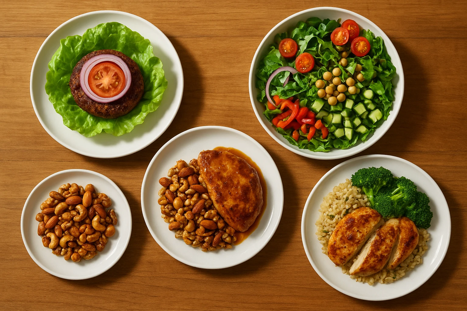
BURGER-CLASSIC - Image A (default):
BURGER-CLASSIC-A - Image B (close-up):
BURGER-CLASSIC-B - Image C (with hand + fries):
BURGER-CLASSIC-C
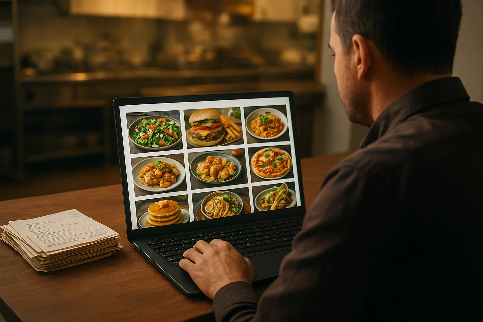
In Yummify, use these names when you make photos. Every variant gets a clear label from the start. Not “IMG_2930-final-FINAL.png.” The label stays with the photo. Use it when you upload to DoorDash, Uber Eats, your QR menu, or your website.
DoorDash notes that pro photos matter. Guests scroll fast. Your photo is often the only thing they see before they tap. Clear IDs help you track which photos work best.
Capture a clean baseline
Track each item for 2-4 weeks. Do this before you swap photos. Capture these metrics:
- Menu views
- Add-to-cart rate (% of views that become orders)
- Units sold and gross sales
- Profit (if you track food cost per item)
Skip promos. Skip price changes. Skip big events during this time. When you change photos, you’ll compare like to like. Keep it simple. Don’t use fancy math.
Copy this checklist into your sheet:
- Give each menu item a unique ID across POS and apps.
- Give each Yummify photo a unique ID (like ITEM-01-A, ITEM-01-B).
- Note which photo is live on which channel (Uber Eats, DoorDash, QR, web).
- Track 2-4 weeks of views, add-to-cart, and sales before changes.
- Set a weekly or monthly report to pull these metrics by item.
New to exports? This video shows how to use AI in a spreadsheet to read sales data. You don’t need to be an analyst:
NielsenIQ found that three metrics explain most online visual success: views, conversion, and sales. You’re doing the same for your menu. Need more on tests? See our guide on A/B testing food photos. You can use the same setup for QR menus that convert.
Write down how you label menu items now. Short names? PLUs? Internal codes? Decide where a simple photo ID like “ITEM-A/B/C” should live. Make sure everyone follows it.
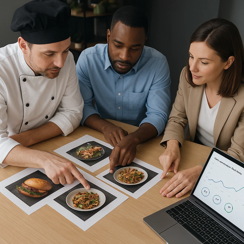
3. Test and learn: turn food photos into always-on A/B experiments
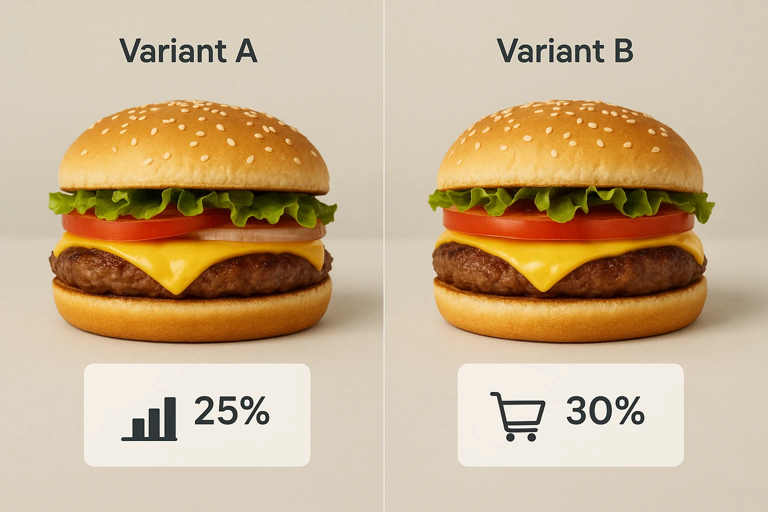
Once you label each photo variant, you can treat photos like any test. A/B testing means showing different versions to similar audiences to see what works. Optimizely calls this a proven way to boost digital experiences.
Start with high-margin puzzles
Your menu report is your target list. Toast explains that Puzzles have high margins but low sales. They’re perfect for photo tests because:
- Each extra order means more profit.
- The dish already works. It just needs better photos.
Example: a poke shop sees its “Spicy Tuna Bowl” has a 70% margin but sells less than the “Salmon Classic.” Instead of discounting, they:
- Use Yummify to make two new photos: one overhead shot with bright toppings, one close-up with chopsticks.
- Test those against the current photo on one delivery app for 3-4 weeks.
A four-step Yummify test workflow
Use this simple steps for any category:
- Pick 3-5 items. Focus on high-margin Puzzles or core items that need more clarity. This food imagery analytics workflow helps prioritize.
- Make 1-2 variants in Yummify. Change one thing at a time: crop tighter, show a bite, add a drink. Keep the dish honest.
- Split traffic fairly. On channels that allow it, rotate photos evenly over time. If you swap by hand, run Variant A for two weeks, then Variant B for two weeks.
- Compare to baseline. Check add-to-cart rate and sales against your original window. Call a winner only if it beats your set threshold. Aim for +10-15% add-to-cart. Also ensure you’ve run at least two full business cycles.
This doesn’t need fancy tools. Export two date ranges from your delivery dashboard or POS. Compare them in a basic sheet. Log the outcome in a simple “photo test log.” Run multi-location brands? See AI photos for franchise consistency and seasonal AI food styling playbooks to plan tests before big promos.
Pick one profitable dish that sells less than it should. Sketch two ways its photo could look different. Different angle? New garnish? New serving dish? That’s your first test.
4. Read the signals: from metrics to menu moves
Running tests is easy. Acting on them makes or loses money. Look for patterns across three signals: views, add-to-cart rate, and sales. Then decide your move.
How to interpret common patterns
NielsenIQ’s research shows how to read digital shelf signals. Use this simple matrix for your reports.
| Signal pattern | Likely story | Recommended move |
|---|---|---|
| Views up, add-to-cart flat, sales flat | Item is more visible, but the photo isn’t persuasive. | Try a stronger close-up. Use clearer plating. Focus on ingredients with a new variant. |
| Views flat, add-to-cart up, sales up | Photo converts existing traffic better. This is real creative lift. | Roll this photo out as the hero across delivery apps and QR menus. |
| Views up, add-to-cart up, sales steady | Awareness is up, but stock or capacity may limit sales. | Check if you’re out of stock or limiting kitchen capacity. If not, feature it more. |
| Views flat, add-to-cart down, sales down | The new photo confuses or turns off guests. | Go back to the prior winner. Check if the photo misleads about the dish. |
Always compare clean time windows: 2-4 weeks before the photo change and 2-4 weeks after. Skip big promos or price changes. If you changed multiple things (new price, new promo, new photo), treat results as hints only. Plan a cleaner test for next time.
Tie results back to menu decisions
When you trust the signal, use it in your menu and ops. This food imagery analytics insight supports restaurant menu optimization:
- Promote winners. Move proven hero photos to top spots or category covers. Reuse them on QR menus and your website to improve digital menu performance.
- Restyle or drop strugglers. Chronic low performers with honest photos may be true Dogs. Consider smaller portions or retire them.
- Check for honesty. If an aggressive photo gets clicks but reviews say “doesn’t match the picture,” adjust. Our guide to honest imagery for allergens and dietary claims explains why this matters. It’s key for legal reasons and repeat visits.
Over time, you’ll see patterns by category. Bowls may work best overhead. Burgers may win with side close-ups. Write these patterns in a shared note. New dishes can start with the “likely winner” style. Enter new markets soon? Pair this with multilingual menus and visuals so copy and photos fit the audience.
Think back to one photo change you made in the last few months. A signature item or promo. Pull a 2-4 week before/after report. Write down what actually changed in views, add-to-cart, and sales.
5. Make the loop a habit with Yummify
Closing the loop once is a project. Keeping it closed is a habit. Make photo analytics something your team handles in 30-60 minutes a month. Skip the scary quarterly overhaul.
Design a simple monthly ritual
Use this checklist each month. Anyone can own it as part of a consistent AI food photography workflow:
- Assign a photo owner. This could be your marketing lead, GM, or ops manager who handles menus.
- Review performance. Once a month, export metrics for test items. Look for big moves up or down. A food imagery analytics review reveals trends.
- Update Yummify. Promote winning variants to your “master” photo per dish. Upgrade winners to higher resolution for print or high-traffic spots.
- Sync channels. Swap in winners across delivery apps, QR menus, and your website. Guests see the same best photo everywhere.
- Log learnings. Write what you changed and what happened in a shared “photo playbook” by category (burgers, salads, bowls, catering).
Pick a quarterly focus area. One quarter on catering (use our guide to sell more catering with AI-styled platters). Another quarter on delivery brands (see AI photography for cloud kitchens).
Get more value from each winning photo
Yummify uses credits. Make many ideas at standard quality. Save high-res upgrades for clear winners. This helps you:
- Quickly test many concepts for a seasonal category. See what sells. Then invest in upgraded files. Only do this for top performers.
- Reuse winners across channels with similar buying contexts. Delivery apps and QR menus work well together. Still test separately for packaging or social.
After a few cycles, your library becomes an asset. Not just pretty photos. It’s proof of which visuals sell and which don’t. That’s the heart of closing the loop. The food imagery analytics results speak.
Block 30 minutes on your calendar next month for a “photo review.” Decide who should join. Kitchen? Marketing? A trusted shift lead? Make sure photo choices match what works in the dining room. Make sure they work on screen too.
Next steps
Ready to treat every photo like a test? Pick three high-margin dishes. Give each a set of Yummify variants. Label them clearly. Pull a quick baseline report from your POS or delivery app. Run your first 2-4 week comparison. See which photos move add-to-cart and sales? Upgrade those winners in Yummify. Roll them out across delivery apps, QR menus, and your website. Your best photos should work everywhere guests order.
FAQ
How much of a sales lift can I expect from better photos?
Good photos can boost conversion. Results vary by concept. DoorDash reports that pro photos help guests feel confident ordering. This tends to increase orders for featured items. McKinsey’s food delivery analysis shows how crowded markets make visuals a key differentiator. In practice, operators who test photos often see modest lifts on specific items. This works best for high-margin Puzzles you ignored before. The goal is to find and keep those wins. Build them up item by item over time.
What if we don’t have a marketing or data person-can a lean team still do this?
Yes. This workflow works for operators who live in spreadsheets and delivery dashboards, not BI tools. You need someone who can export basic reports, keep a simple test log, and update images on your channels. That might be a GM, an owner-operator, or a trusted shift lead. Start tiny. Pick one category. Try a couple of items. Track just add-to-cart and sales. Over time, build a rhythm where image review is just another part of your monthly menu check. Skip the separate data project.
How do I avoid misleading guests when optimizing photos for clicks and sales?
Your best-performing photo still has to be honest about portion size, ingredients, and allergens. That means no fake toppings you don’t serve. No hiding key parts for dietary needs. No unrealistic portions that disappoint guests on delivery. If you test bolder styling in Yummify, anchor it to what the dish really looks like in your packaging or on the plate. Need more guardrails? Pair this workflow with policies from an internal playbook or our article on honest imagery for allergens and dietary claims. Adjust fast if reviews say photos and reality don’t match.
Which channels should I prioritize for image testing: delivery apps, QR menus, website, or listings?
Most operators see the clearest impact by starting with delivery apps. Guests rely heavily on photos there. Conversion is easy to measure. Once you have winners, extend them to your QR menus and online ordering site. Guests will see consistent, high-performing visuals wherever they order. Research from the National Restaurant Association shows digital experiences are now central to guest expectations. NielsenIQ’s work on the digital shelf highlights how hero images drive clicks in crowded product grids. After you standardize your core ordering channels, adapt top images for Google Business Profile and third-party listings as time allows.
How long should I run an image test before deciding on a winner?
Aim for at least two full business cycles. That’s typically 2-4 weeks per variant. Run long enough to gather a meaningful number of impressions and orders. Optimizely’s guidance on A/B testing emphasizes not calling winners too early. Small early swings can be random noise. Low-traffic locations may need longer windows. High-volume shops can sometimes see clear signals sooner. In practice, run fewer well-powered tests. Don’t run many tiny ones you can’t interpret. Set your minimum duration and traffic thresholds before you start. You won’t chase early spikes that way.
Can I reuse winning delivery-app images for catering, packaging, or social campaigns?
Often yes, but context matters. A photo that performs well in a delivery grid works for quick comparison and tapping. That also works for QR menus and many website layouts. For catering, packaging, or social, you might want additional angles. Think wider table spreads or lifestyle shots that highlight scale or occasion. Yummify makes it cheap to generate those once you know which core styling cues work. Treat delivery results as a strong starting point. Then run lighter, channel-specific tests where stakes are higher or buying behavior differs.
Related posts
15 Creative Food Photography Ideas to Make Your Dishes Stand Out
Discover creative food photography ideas to make your dishes stand out. Learn action shots, deconstructed dishes, unique angles, storytelling, and AI tools for stunning food visuals.
The Death of the $2,000 Food Photoshoot
Why big food photoshoots are dying and how AI workflows let restaurants keep menu photos fresh across delivery apps, QR menus, and campaigns-without $2K days.
Honest Imagery for Allergens and Dietary Claims
A practical guide to honest food photography for allergens and dietary claims-how to align recipes, menu text, and AI photos so guests stay safe and still convert.