From Screen to Shelf: AI Visuals for Packaging, Labels, and Merch
The gap between screen assets and shelf reality
Picture this: your burger ghost kitchen finally lands a local grocery placement for your signature sauce. You’ve got great Instagram photos, but your printer asks for a 300?DPI hero image for a 3?4 inch label, plus a shelf talker, and a 24?36 endcap poster. Suddenly, your social feed isn’t enough. You need consistent, print?ready visuals fast. That means avoiding $3,000-$6,000 in costs and waiting 2-4 weeks for a traditional 20?dish shoot.
Here’s the hidden trap. Social photos are optimized for speed and small screens. Packaging needs deliberate framing, negative space for copy, and repeatability across SKUs. AI packaging mockups require these adjustments to work at shelf scale. In-store materials (wobblers, clings, menu boards) amplify any inconsistency: a warm, rustic taco shot on the jar but a cool, high?key burrito on the poster looks like two different brands.
Three concrete situations we see weekly:
- An independent taqueria spins up a salsa line. Labels need tight crops that read at arm’s length, while shelf talkers need wider compositions. Using random photos leads to mismatched tones and props.
- A coffee chain tests take?home granola: poster photography must match the app thumbnails to avoid customer confusion in store. Mixed styles tank recognition.
- A meal?kit startup needs 5 label variants for A/B testing this month. Waiting for a photoshoot means missing the seasonal window entirely.
Yummify’s branded environments bridge the gap. Define your brand’s lighting, props, and mood once, then apply it to every dish image used on packaging, labels, and merch. Same recipe, same visual rules-across every touchpoint.
Summary: Social assets rarely scale to packaging or in-store needs. Consistent, print?ready visuals are required; Yummify’s branded environments make that repeatable across all touchpoints.
Why old methods break at packaging, POS, and merch
Let’s break down the common workarounds-and why they collapse at print scale.
-
Stock photos. They’re fast but rarely match your dish. If your margherita jar shows a stock photo with basil piles you don’t serve, customers notice the bait?and?switch. We’ve seen operators reprint 500 food label design items (~$0.18 each = $90 + time) after customers complained that the in?jar product didn’t match the label photo. Stock also guarantees no brand?unique look; your competitor could use the same image.
-
DIY phone shots + editing apps. You can make an okay Instagram post, but packaging needs consistent lighting, repeatable angles, and whitespace for UPCs and legal copy. A pizza shop we advised tried to hand?shoot for labels; the cheese texture looked fine on a phone but blurred when scaled for a 24?36 poster. Reprinting two posters at $40 each is cheap; the credibility hit is not.
-
Traditional photoshoots for every SKU. Beautiful, but slow and expensive. A 20?dish session runs $3,000-$6,000 and takes 2-4 weeks (photographer, stylist, location, edits). If you need 3-5 variations per SKU for testing, costs balloon. A meal kit brand needing 30 variants would be looking at multiple sessions and schedule pain.
-
Generic mockups in design tools. Drag?and?drop mockups with arbitrary shadows don’t carry your brand’s food style. AI packaging mockups from Yummify maintain consistent styling. The jar looks fine, but the hero dish photo inside the label window doesn’t match your Instagram or app thumbnails. Result: fractured identity.
Net: these approaches either waste money (reprints, reshoots) or erode trust because visuals don’t match across packaging, signs, and merch.
Summary: Stock, DIY edits, and constant photoshoots fail at print scale-costly, slow, and off?brand. You need a repeatable method to produce matching dish imagery for packaging, POS, and merch.
The Yummify workflow: from dish to dieline-ready art
Here’s a practical, repeatable path that keeps your brand system intact while producing packaging, in?store, and merch visuals from the same dish images.
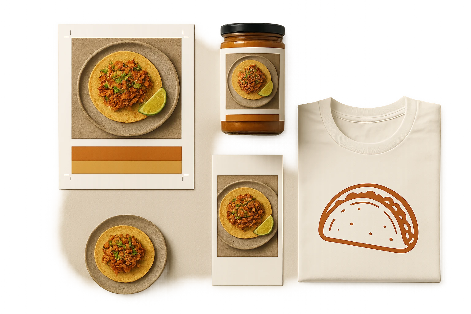
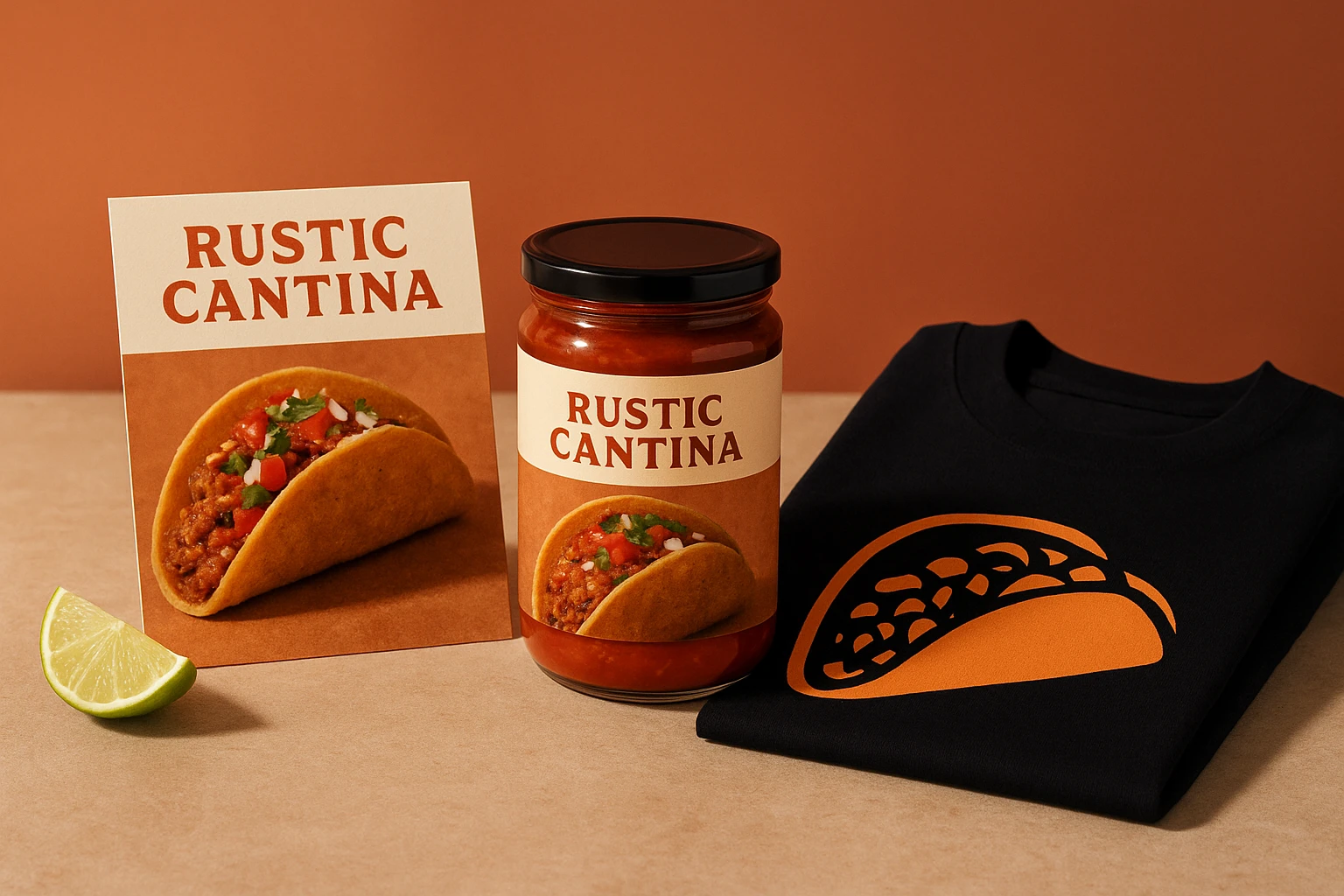
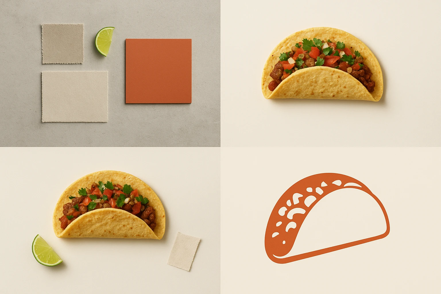
Step 1: Build your branded environment. Define lighting (e.g., warm terracotta), surface (sealed concrete), props (lime wedge, neutral linen), and camera angle. Save it once; reuse forever. Example: an Austin taco shop’s “Rustic Cantina” environment yields warm, wood?toned tacos on every asset-from jar labels to shelf wobblers.
Step 2: Generate base images. Upload a reference photo (or start from a text prompt). Yummify validates it’s food, then renders options in minutes using AI food photography. Create 3-5 variants per dish to test cropping for labels vs posters. Example: a ghost kitchen’s “Neon Night Market” environment produces bold, high?contrast noodle bowls for pouch packaging and backlit menu boards.
Step 3: Select and upgrade strategically. Keep testing at standard quality, then upgrade only the winners to medium/high for print. If you need 12 SKUs, upgrade 12 heroes; leave the rest at standard for internal comps.
Step 4: Export for use. For packaging, export a clean PNG/JPG with generous negative space so designers can place it in dielines. For in-store signage, export larger crops suitable for 24?36 at 150-300 DPI. For merch, choose simplified compositions that screen?print cleanly.
Step 5: Lock consistency. Use the same environment across your delivery app thumbnails, jar labels, shelf talkers, and T?shirts. That repetition builds instant recognition on shelf and online.
Two concrete applications:
- Labels: Tight taco close?up with diagonal composition, 15% top clearance for branding.
- Merch: Wider crop with the same plate and linen, printed on a 2?color tee to keep costs down.
Summary: Use Yummify once to define your brand environment, then generate, test, upgrade, and export images for packaging, in?store, and merch-consistently and fast.
Case study (hypothetical): Salsa Lobo’s 7-day rollout
A realistic example to illustrate scope, speed, and cost.
Brand: Salsa Lobo, a 3-location taqueria adding retail salsas. Goals: 3 jar labels (Roja, Verde, Habanero), a 24?36 endcap poster, two shelf talkers, and a staff T?shirt.
Day 1: Brand setup. Create two environments: “Rustic Cantina” (warm, wood, cast shadows) and “Market Bright” (clean, tile, high key). 60 minutes total.
Day 2: Image generation. Upload one iPhone shot per salsa paired with a representative taco. Generate 5 variants per flavor in each environment = 30 images. Time: ~45 minutes of operator time; renders complete in under an hour.
Day 3: Review + testing. Internal review narrows to 2 variants per flavor for labels; 1 variant per flavor for shelf talkers; 1 hero for poster. 9 candidates upgraded to high quality for print.
Day 4-5: Design integration. Designer places images into dielines (3?4 inch labels with 0.125 inch bleed), builds poster and shelf talkers. Color checks and soft proofing performed.
Day 6: Merch. Choose one wide hero image for a 2?color screen?printed tee; test a single-color halftone version for cost control. AI packaging mockups make this process efficient.
Day 7: Print and deploy. Small batch: 300 labels per SKU (900 total), two posters, four shelf talkers, 24 shirts. Restaurant merch benefits from the same visual consistency.
Outcomes (hypothetical but realistic):
- Savings vs traditional shoot: $3,000-$6,000 avoided, with delivery in 7 days instead of 2-4 weeks.
- Consistency: Every asset uses one of two environments, so shelf, staff apparel, and delivery app tiles feel like one brand.
- Early signal: A/B test on label crops shows diagonal composition outperforms straight-on by 11%. This came from a quick point-of-sale survey (n=82).
Summary: In one week, a taqueria creates label, in?store, and merch visuals from two Yummify environments, avoiding a multi?week photoshoot and keeping a consistent look.
Implementation checklist: lock your brand, scale your assets
Follow this blueprint to go from concept to shelf while staying on-brand.
-
Audit brand rules. Identify lighting temperature, background surfaces, and prop palette. Decide on one hero angle for packaging (e.g., 45?) and a secondary angle for posters (e.g., top?down). Document these in a one?page guide.
-
Build 2-3 branded environments in Yummify. For a burrito brand, try: “Street Foil” (cool metal, harsh highlights), “Cantina Wood” (warm board, soft light). Generate 3-5 variants per dish.
-
Crop for usage. Labels need tight crops with 10-20% negative space for lockups and legal copy. Posters can go loose with contextual props-just keep the same prop set across all assets.
-
Prep for print. Upgrade final selections to higher quality, then export at sizes that hit 150-300 DPI at final dimensions. Convert to CMYK in your design app if your printer requires it. Always include 0.125 inch bleed on packaging.
-
QA checklist.
- Consistency: Same surface, lighting, and tone across SKUs and POS.
- Readability: Does the image still read from 6 feet away on a poster? From 2 feet on a shelf?
- Color: Soft?proof against your printer’s profile; print one sample.
- File names: Brand_SKU_Flavor_View_v01.jpg to avoid version chaos.
Common pitfalls to avoid:
- Mixing environments across the same SKU family (looks disjointed).
- Over?prop styling that crowds label copy.
- Ignoring bleed/safe area on dielines.
- Skipping test prints; what pops on a phone can muddy in CMYK.
Do this once, and every new SKU, wobbler, or tee pulls from the same visual DNA.
Summary: A practical checklist for building environments, cropping, prepping for print, and QA-so packaging, POS, and merch all match your brand system.
Next steps
Run a real test this week: pick one hero dish and build a single branded environment in Try Yummify free. Generate five variants, choose two, and place them into a jar label and a shelf talker. Upgrade just the finals to high quality. Convert to CMYK in your design app. Then print one sample set at your local shop. This AI packaging mockups approach works well for testing. If the look holds up from phone to shelf, you’ve got a repeatable system. Next, replicate the process for two more SKUs. Add a simple merch item (one tee or tote). You’ll have an on-brand mini product line in days, not weeks.
FAQ
Can I use my own photos for packaging, or should I start from text prompts?
You can do either. If you have decent phone shots, upload them and let Yummify restyle the scene to match your brand environment. This preserves your actual dish while fixing lighting and composition. If you lack photos, start from a text prompt and generate variations, then narrow to the most label?friendly crops. The AI packaging mockups results speak for themselves. For print, upgrade final selections to higher quality and export at sizes that meet 150-300 DPI at final dimensions.
How does this compare to hiring a photographer for packaging?
Traditional shoots deliver beautiful results but require scheduling and budget: roughly $3,000-$6,000 and 2-4 weeks for ~20 dishes. Yummify generates styled images in minutes and lets you test multiple options before committing. Many teams use Yummify for volume (labels, POS, merch) and hire a photographer quarterly for a single hero campaign. That hybrid approach keeps costs predictable while preserving top-tier moments.
What if my food doesn’t photograph well under kitchen lighting?
Start with the best you have-window light, neutral surface, and sharp focus help. Yummify’s styling replaces the background and lighting per your branded environment, so imperfections in the original setup matter less. If the reference still struggles, generate from a detailed text prompt and compare results. You can mix both methods and keep whichever reads best at print size.
Do I need special design software to make labels and posters?
You’ll need a basic layout tool to place images into printer dielines-anything from Illustrator to Affinity Publisher works. Yummify exports standard PNG/JPG files, so no special formats are required. Ask your printer for dielines and color profiles; place the image, set bleed (typically 0.125 inches), and convert to CMYK if requested before export.
Will the colors match in print if the images are AI-generated?
Yummify exports in RGB, which is typical for on-screen use. For print, convert to CMYK using your printer’s profile and do a small proof before full run. Expect slight shifts in saturated reds and greens; adjust in your layout app if needed. A single test print prevents expensive mismatches across labels or posters.
How long does it take to learn and produce a first set?
Most teams build their first branded environment in 30-60 minutes. Plan another hour to generate 10-20 variants and pick winners. Placing the final images into label and POS dielines typically takes a designer 60-90 minutes. You can go from zero to a small, print?ready set in a single afternoon.
Can I manage multiple brands or locations with different looks?
Yes. Create separate branded environments for each concept (e.g., classic cantina vs. modern minimal) and name them clearly. Share the chosen environment names in your brand guide so franchisees and agencies generate images from the same presets. This keeps regional specials and national SKUs visually consistent.
Related posts
15 Creative Food Photography Ideas to Make Your Dishes Stand Out
Discover creative food photography ideas to make your dishes stand out. Learn action shots, deconstructed dishes, unique angles, storytelling, and AI tools for stunning food visuals.
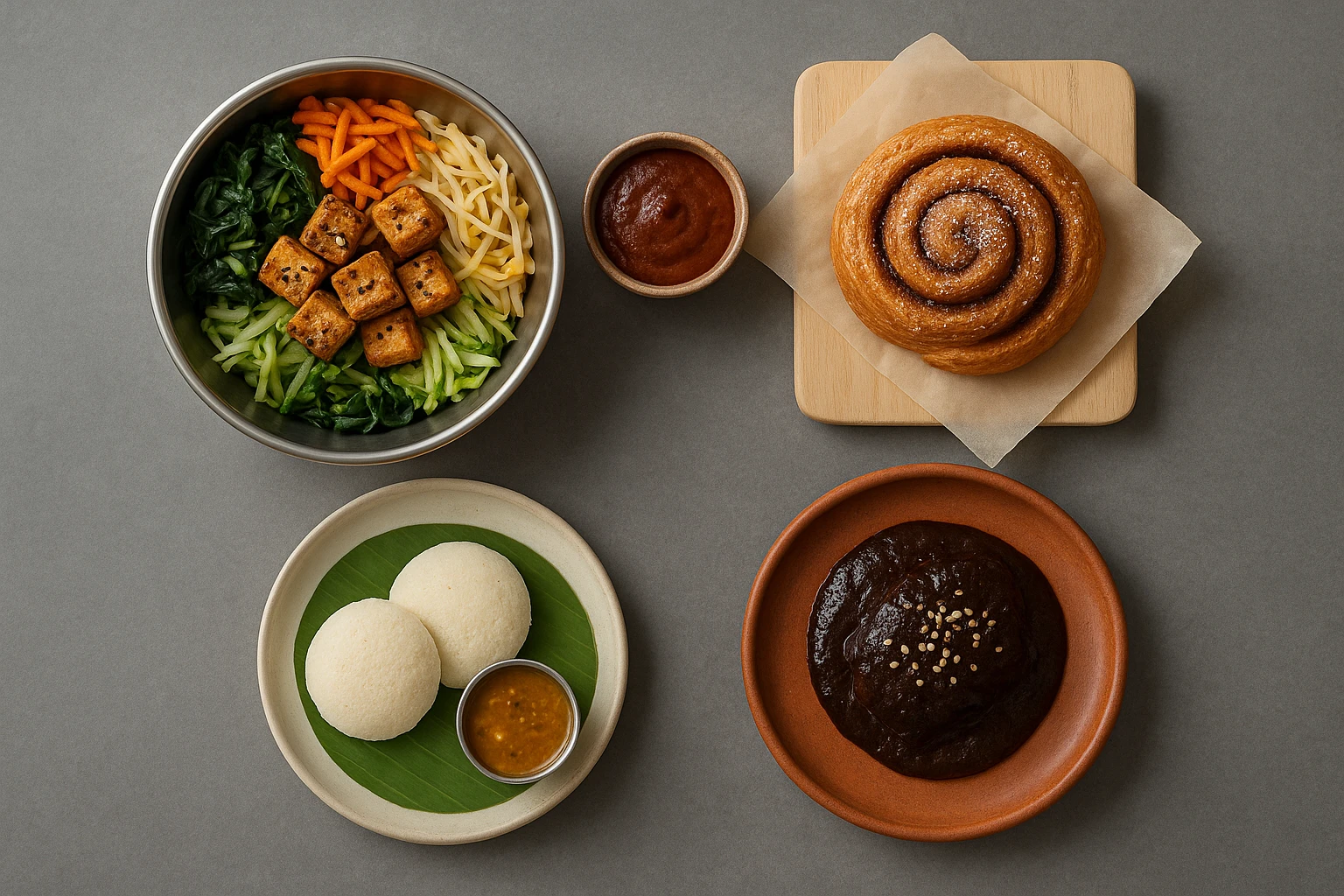
Beyond Burgers: AI Food Styling for Diets and Cuisines
Use AI food styling to create accurate vegan, gluten-free, halal, kosher, and global cuisine photos that convert across delivery apps, QR menus, and social.
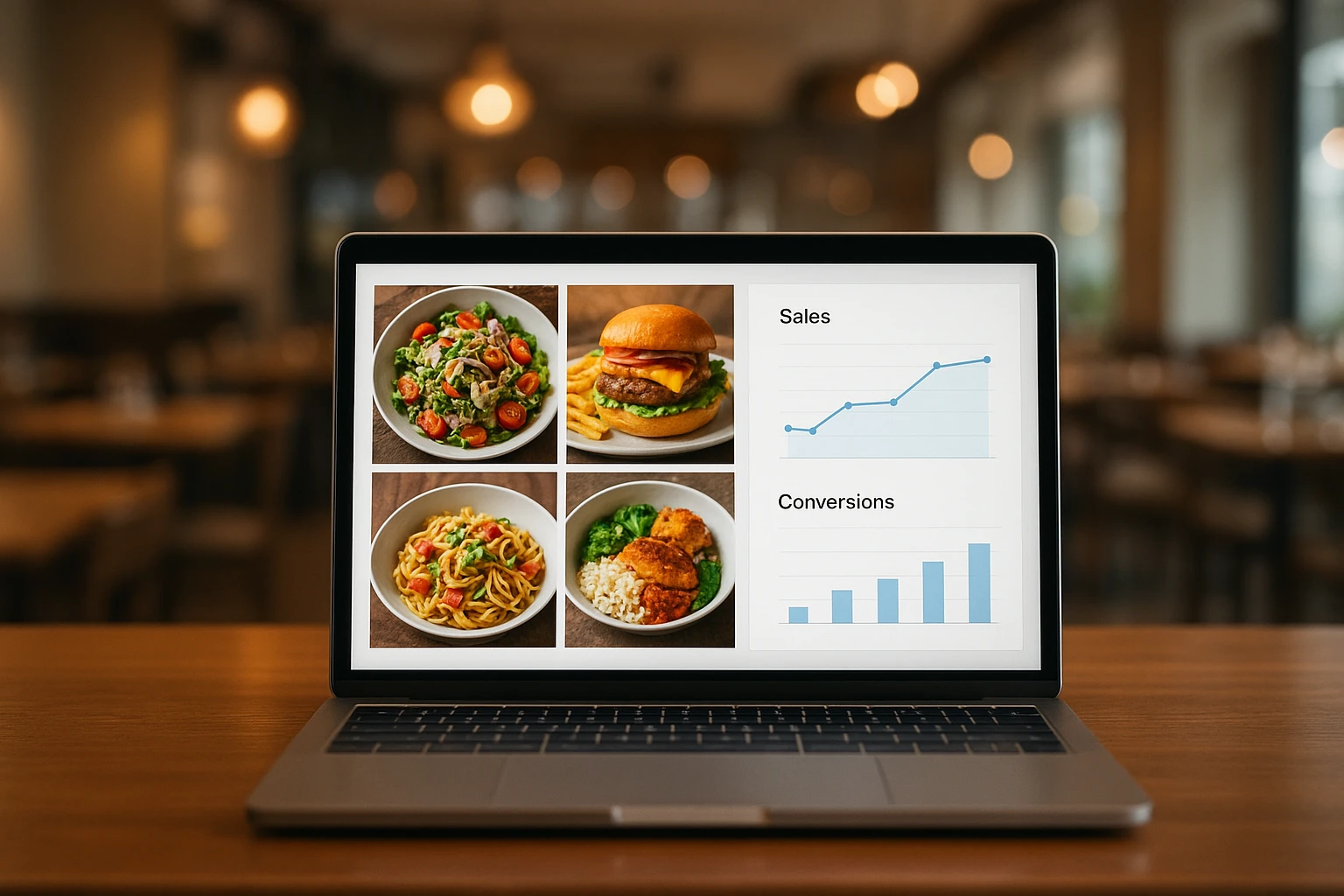
Close the Loop: Tie Food Imagery to Analytics and Sales
Stop guessing which food photos work. Learn a simple workflow to tie Yummify images to analytics, A/B test visuals, and promote only the photos that actually sell.