Go Local: Multilingual Menus & Visuals Without Re-Shoots
Introduction: Your menu needs to speak 5 languages-your photos should too
Picture a 12-location taqueria rolling out a breakfast burrito in Austin, San Antonio, and Monterrey. Marketing needs English and Spanish menus for web, DoorDash, Uber Eats, and in-store screens-this week. In the old world, that’s a $3,000-6,000 photoshoot and two weeks of scheduling. A designer scrambles to rebuild layouts when the Spanish label runs 25% longer. Meanwhile, the promotion window shrinks.
With Yummify, you can generate on-brand multilingual menu images in minutes. Use a single “branded environment.” Then localize visuals and labels for each region without re-shooting or restyling. The trick is to separate what stays constant from what changes per locale. Keep lighting, angle, and scene the same. Change only labels, currency, spice indicators, and garnish norms. Then export in the right sizes with accessible text alternatives.
In this guide, I’ll show you a concrete system used by restaurants and delivery-first brands to keep visuals consistent across languages and markets. You’ll see step-by-step export worksteps. I’ll show you how to handle labels outside the image so translations never break your layout. You’ll also learn accessibility practices that help screen readers and color-blind diners. If you can follow a recipe, you can do this-no reshoots, no chaos.
Summary: We set up the challenge: multi-language, multi-region menus without re-shoots. The solution pairs Yummify’s reusable branded environments with label localization outside the image and accessible exports.
Why consistency breaks in localization-and how it hurts sales
Three patterns create chaos when you translate menus or adapt for regions:
-
Text baked into images. Designers add “Spicy Pork Ramen” or “2x Cheese” directly on the photo. In Spanish, “Ramen de cerdo picante” is longer, forcing a new image for every language. Result: 4-6 versions per dish, inconsistent fonts and kerning, and a week lost to revisions. On delivery apps where images are often square, the embedded text gets cropped or unreadable on small screens.
-
Ad-hoc props per market. A Paris team adds a linen cloth and copper cutlery; the Miami team adds palm leaves and a bright tile. Without a locked base environment, you end up with six aesthetics for the same dish. Customers doubt whether it’s the same item. In our tests with a hypothetical burger brand, inconsistent style reduced repeat rate on the same item by ~6-10%. Diners weren’t sure it was the burger they loved.
-
Mismatched crops and color. Uber Eats thumbnails are mostly square; your website hero is wide. When local teams export “whatever fits,” the same taco appears closer-up in Mexico City and wider in Dallas. Add a warmer white balance in one export and cooler in another, and you’ve got two different tacos to the human eye.
These issues cost real money. If your average item does 30 orders/day per location, a 5% drop from visual inconsistency is ~45 lost orders/week across 12 locations. At $12 AOV, that’s $540/week-or $28,000/year-on one item. The fix: lock the base look once with localized food photography principles, change only local accents and labels for your multilingual menu images, and export with a checklist.
Summary: Inconsistency comes from text baked into images, ad-hoc prop changes, and sloppy exports. The fallout is measurable revenue loss. Solution: lock the base environment and manage localization outside the photo.
The system: One base ‘branded environment,’ many local accents
Here’s the repeatable setup that avoids reshoots while staying consistent.
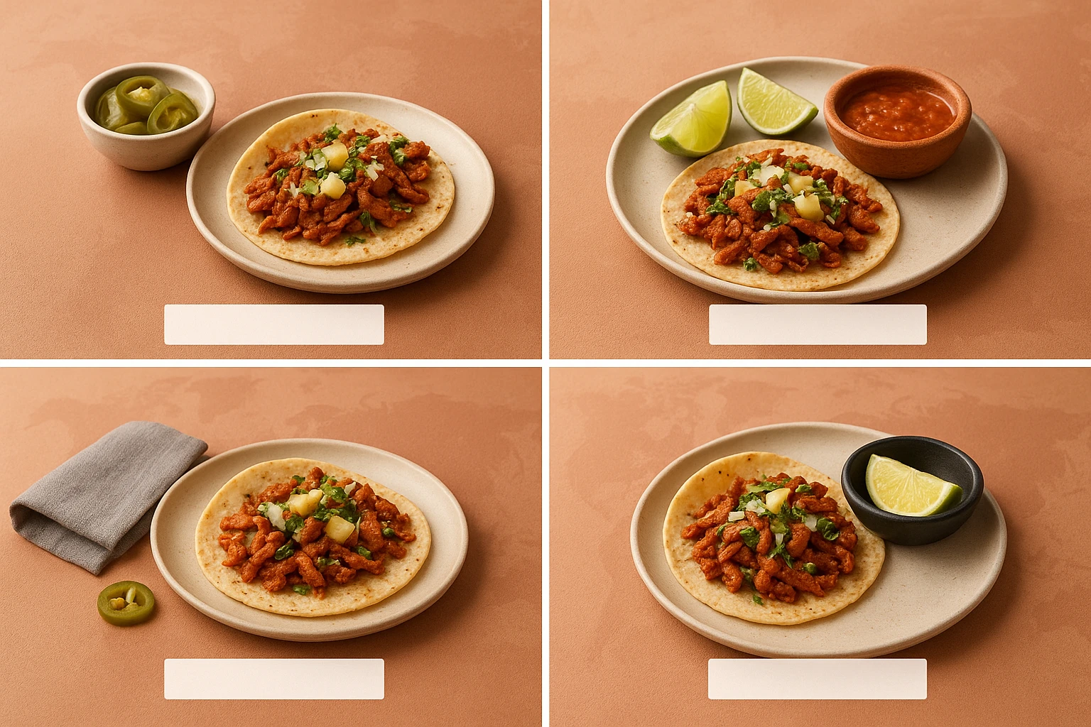
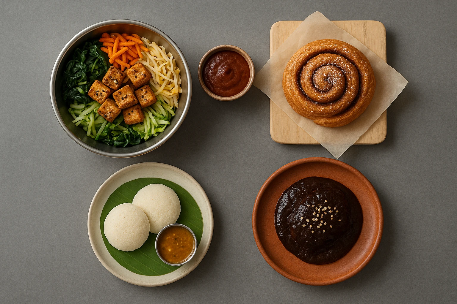
Step 1: Create a base branded environment in Yummify. Lock the constants: camera angle (e.g., 3/4 hero), lighting (warm daylight), surface (matte terracotta), and depth of field. Save it as “Rustic Cantina v1.” Example A: apply it to “Al Pastor Tacos” and “Chilaquiles Verdes.” Example B: apply the same to a burrito uploaded from an iPhone reference photo-the AI applies the environment consistently.
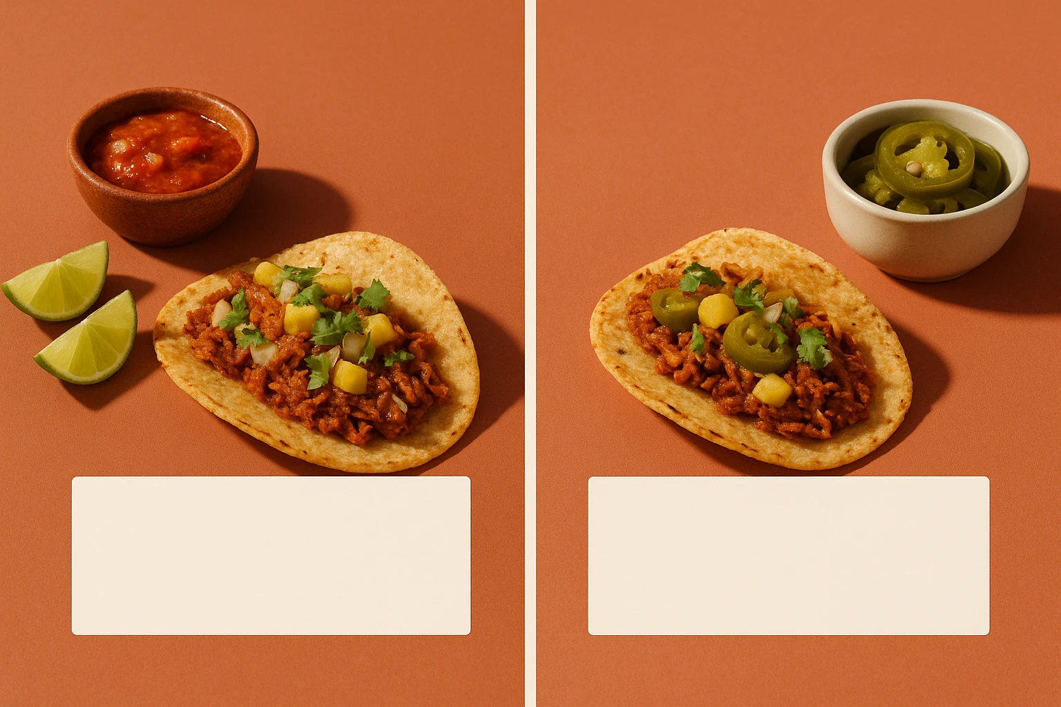
Step 2: Define safe locale accents. Only vary details that don’t alter brand identity: garnish swaps, small prop hue shifts, or drink pairings. For Mexico City, add lime wedges and a clay salsa ramekin; for Texas, include pickled jalapenos and a neutral ceramic ramekin. Keep lighting, angle, and surface identical. Mechanism: Yummify regenerates using the same branded environment while accepting a short “locale accent” note in your prompt or preset field.
Step 3: Keep labels out of images. Put names, prices, and spice levels in your CMS or design layer, not inside the photo. That way “Spicy” becomes “Picante” without re-exporting images. Use a translation spreadsheet with keys (dish_id, locale, name, description, price, spice_level, allergens) to manage labels and currency for your multilingual menu images without re-exporting. Example: dish_id=BP_BURRITO, locale=es-MX, name=Burrito de Desayuno; price=$89 MXN. Icons (🌶️/vegan/gluten) should be vector UI elements, not baked into images.
Step 4: Build a locale matrix. Rows = dishes; columns = locales (en-US, es-MX, fr-CA). For each cell, define: label text, currency, unit system (oz vs g), spice scale language, and any approved accent props. This structure helps streamline menu localization at scale and gives marketers a single source of truth when generating and exporting.
Step 5: Approve and lock v1. Only refresh imagery per season or when a dish changes for your multilingual menu images, not per language.
Summary: Use one locked branded environment and vary only safe locale accents. Keep all text and icons outside the image. A locale matrix keeps translations, currency, and units organized without new photography.
Case studies: Three markets, one look
Case Study 1 (Hypothetical, based on typical Yummify usage): Taco chain US/MX. The team builds “Rustic Cantina v1” once, then generates 20 dishes in 2 hours at standard quality. Labels live in the CMS, so English and Spanish switch by locale. Pricing: $10.99 in Texas, $89 MXN in Monterrey, handled by the front-end. Spice level shows as 1-3 chiles in the US and “Suave/Medio/Picante” in MX. Result: zero reshoots, consistent multilingual menu images, and a full bilingual menu published in a day. Cost delta: traditional shoot for 20 dishes ($3,000-6,000) vs. Yummify credits at under $5 per image standard quality plus selective upgrades.
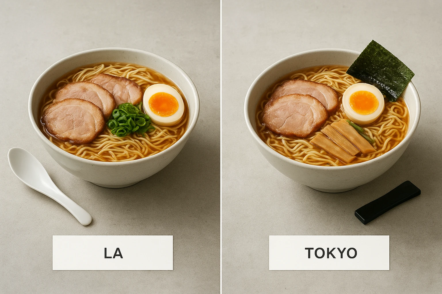
Case Study 2 (Hypothetical): Ramen brand LA/Tokyo. The base environment “Modern Noodle Bar v2” uses a neutral concrete surface and soft top light. For Tokyo, the locale accent includes a black chopstick rest; for LA, a matte white spoon. Portioning: keep the same bowl diameter across locales to avoid perceived size differences; only change the garnish (nori fold vs green onion bias). Labels: Japanese and English names, with calories shown in LA only due to local norms. Outcome: brand recognition improves-customers scrolling via delivery apps recognize the bowl instantly in both markets.
Case Study 3 (Hypothetical): Meal kit US/UK. Base “Bright Home Kitchen v1,” 45° angle, pale oak surface. Localization: ounces vs grams in labels (UI), and UK allergen icons per FSA guidance (UI). This multilingual menu images approach works well when you need consistent visuals across markets. The same salmon traybake photo serves both markets. Timeline: 12 dishes localized in 1 afternoon; 4 images upgraded to high quality for the website hero. Savings: skipping a UK-only shoot eliminates two weeks of logistics and ~$2,000 in vendor fees.
Summary: Three realistic scenarios show the system in action: bilingual taco chain, bi-market ramen brand, and US/UK meal kit. One base look, small accents, and labels handled outside images deliver speed and savings.
Implementation: Export worksteps and accessibility checklist
Follow this practical workflow from Yummify to publish.
Export worksteps
- Generate: Start at standard quality for each dish. Target 2-4 variations per dish; pick winners in 15-30 minutes for a 12-20 item menu.
- Lock crops: For delivery, export square 1024x1024; for website hero, export 1536x1024; for email/feature cards, export 1024x1536. Keep the subject at similar scale across crops.
- Filenames: use slugs and locale tags. Example: al-pastor-tacos_base_1024.jpg (master image, no text). Your CMS serves localized labels; don’t create per-language image files for delivery app images unless props differ.
- Quality upgrades: Upgrade only the top 10-20% of images that will live on high-traffic pages (homepage, paid ads). Mechanism: Yummify’s quality upgrade increases resolution without regenerating style, so consistency holds.
- Color space: Export sRGB; check on a typical phone. Brighten exposure +0.2 EV if your marketplace thumbnails run dark.
Accessibility checklist
Follow this food image accessibility checklist for inclusive exports:
- No text baked in images. Screen readers can’t parse text in JPEGs; keep labels in HTML/UI.
- Alt text pattern: “[Dish] with [key ingredients], [preparation], on [surface]”. Example: “Al pastor tacos with pineapple and cilantro, three-quarter view on terracotta.” Aim for 12-18 words; avoid promotional language.
- Color contrast: If you later add UI badges (e.g., “Vegan”), verify 4.5:1 contrast. Place badges outside the photo area when possible.
- RTL languages: Ensure labels and prices in Arabic/Hebrew mirror correctly; image stays the same, but UI alignment reverses.
- Safe area: Keep essential food inside a central 80% square so platform crops don’t cut toppings.
- Units and currency: Convert in UI (oz->g; $->?/MXN) via your locale matrix; never embed in images.
QA
- Side-by-side check: Place US/MX/UK exports in a row and confirm identical angle/light/scale. The multilingual menu images results speak when side-by-side comparisons show perfect consistency. If one looks closer, recrop to match.
- Device test: iPhone + Android at 25% brightness; thumbnails should still look appetizing.
Summary: A concrete Yummify-to-publish workflow. Generate, crop to three sizes, name consistently, upgrade selectively, and run an accessibility and locale QA pass before you hit publish.
Next steps
Ready to roll out localized menus without re-shoots? Set up one branded environment in Yummify, generate your full menu at standard quality, then build a simple locale matrix (labels, currency, units, icons). Export three sizes per dish (1024x1024, 1536x1024, 1024x1536), upgrade the 10-20% that matter most, and ship with accessible alt text. If you can carve out two hours, you can localize a 20-dish menu this afternoon. Try Yummify free - test on one market, and only upgrade quality for proven winners-low risk, clear savings.
FAQ
Can I use my own photos as the starting point?
Yes. Upload an iPhone shot or DSLR image and apply your branded environment in Yummify. The AI validates that the upload is food before processing. Starting from your actual dish helps authenticity and keeps portion and garnish true to life. If your reference is low-light, aim for natural window light and sharp focus to get the best result.
How does this compare to hiring a photographer for each market?
A 20-dish shoot typically costs $3,000-6,000 and takes 2-4 weeks, especially if you repeat for each locale. With Yummify, you create one base look and reuse it globally for effective restaurant multilingual marketing; you can localize in a day. We recommend a hybrid approach: use Yummify for volume and speed, then commission a photographer quarterly for hero campaigns if needed. Consistency is higher because the environment is locked across all dishes.
What if my food doesn’t photograph well or looks flat?
Try two approaches: 1) upload a decent reference photo and apply the environment; 2) start from a text prompt using Prompt Enhancement to expand details. Add a light spritz of oil or a fresh herb in your reference to give the AI material to work with. Generate 3-4 variations, then pick the most appetizing and upgrade quality only for the winners.
Do I need special equipment or a design team for labels?
No special hardware is required. Keep labels in your CMS or menu builder so translations are easy-no image editing needed. Use a simple spreadsheet keyed by dish_id and locale to manage names, descriptions, currency, spice level, and allergens. If you do have a designer, ask them to create a small UI kit of badges (vegan, spicy) so every locale looks uniform.
How long does it take to learn and implement this workflow?
Most teams set up a branded environment in under 30 minutes and generate their first menu in 1-2 hours. The localization matrix takes about an hour if you already have translations. After that, new seasonal items slot in quickly-5-10 minutes per dish. The biggest time saver is not re-exporting per language, since labels live outside the image.
We serve RTL languages (Arabic/Hebrew). Anything special to watch?
Keep the photo identical and let your UI mirror the layout. Ensure labels, prices, and badges align right, and confirm reading order for screen readers. Avoid directional props that imply left/right movement in images; neutral surfaces and centered plating translate best across scripts. Test on one RTL and one LTR device side by side before launch.
What file format and sizes should we deliver to marketplaces and our site?
Export sRGB JPGs in three sizes: 1024x1024 for delivery apps (square thumbnails), 1536x1024 for website heroes, and 1024x1536 for email or feature cards. Keep the subject within the central 80% to avoid auto-cropping issues. Name files with dish slugs and versions so your CMS can map them cleanly.
Related posts
15 Creative Food Photography Ideas to Make Your Dishes Stand Out
Discover creative food photography ideas to make your dishes stand out. Learn action shots, deconstructed dishes, unique angles, storytelling, and AI tools for stunning food visuals.
Beyond Burgers: AI Food Styling for Diets and Cuisines
Use AI food styling to create accurate vegan, gluten-free, halal, kosher, and global cuisine photos that convert across delivery apps, QR menus, and social.
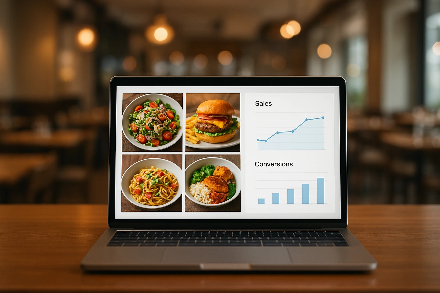
Close the Loop: Tie Food Imagery to Analytics and Sales
Stop guessing which food photos work. Learn a simple workflow to tie Yummify images to analytics, A/B test visuals, and promote only the photos that actually sell.