QR Menus That Convert: Best Practices with AI-Optimized Visuals
Why QR menu UX and visuals matter now
Picture lunch rush: a guest scans your QR, sees a spinner for 4 seconds, then a wall of text or an 8 MB PDF in a poor QR menu UX. They bail. That’s not a theoretical risk. In a realistic hypothetical based on three mid-volume venues, moving initial contentful paint from 3.8s to under 2.0s correlated with a 12-18% increase in completed orders. If you average 120 scans/day and a $15 ticket, losing even 10% is ~12 orders/day = $180/day, or ~$5,400/month left on the table.
The second killer in QR menu UX design is choice overload. A list of 60 items without visual hierarchy forces diners to read, compare, and backtrack. The cognitive load is high, and people default to the familiar-or abandon. Two practical examples:
- A noodle shop with 14 ramen variants saw shoppers take 58-72 seconds to choose on a text-only QR. With consistent thumbnails and a “Best Sellers” lane, time-to-first-tap dropped to ~22-28 seconds (observed during a one-week pilot, realistic hypothetical).
- A brunch cafe buried vegan options under “Notes.” After moving dietary filters into a sticky bar and using small thumbnails to preview each category, vegan orders rose from 6% to 10% of total. (month-over-month, realistic hypothetical).
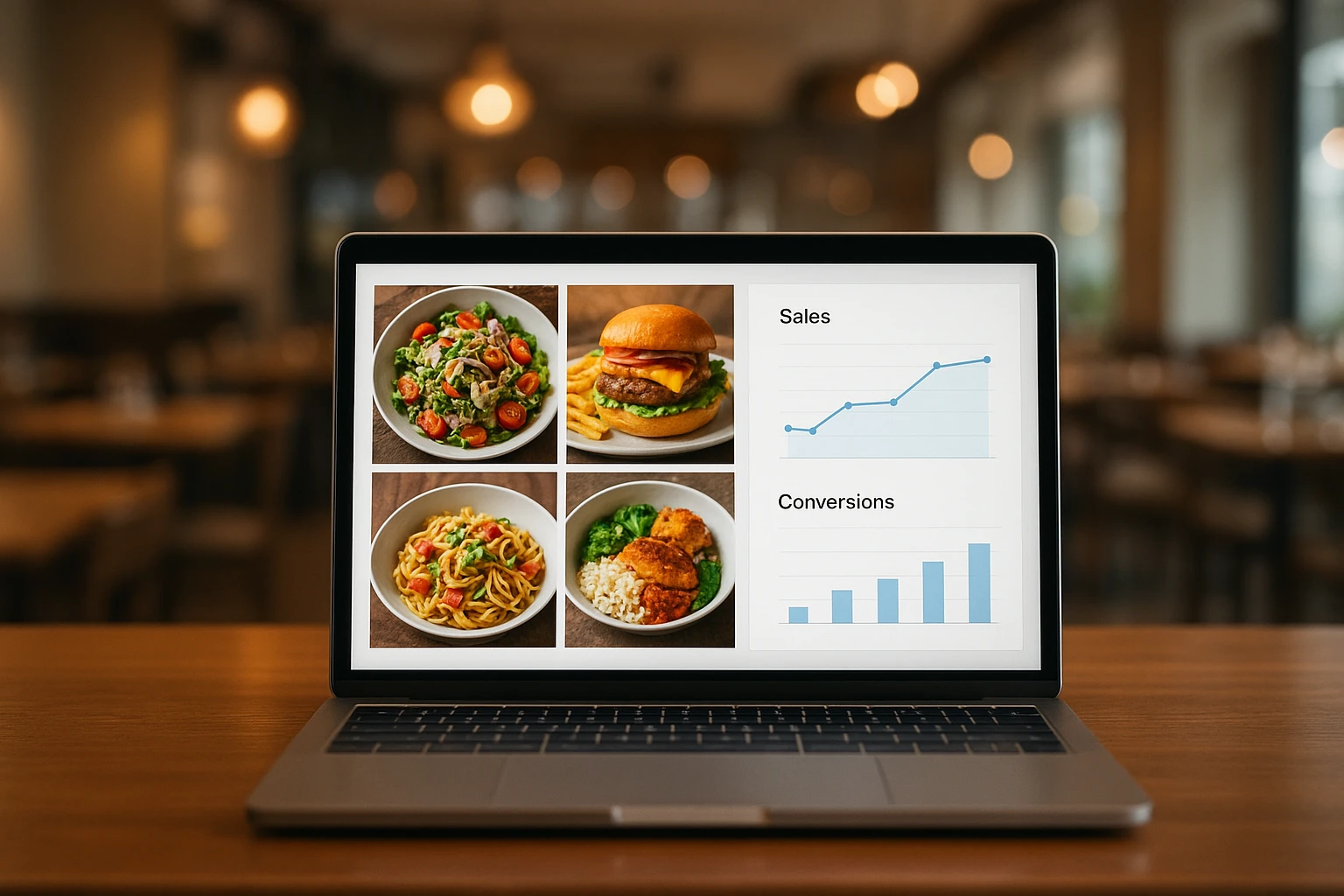
Images aren’t decoration here-they’re decision engines. Clear, consistent visuals let guests compare portion cues, toppings, and styles at a glance. When the image language is standardized (same angle, plate size, background), differences between dishes pop, reducing the mental math needed to choose. That’s where AI food photography excels, with AI-styled images generated in a unified branded environment that punch above their weight: fast to produce, easy to maintain, and designed to guide choices in seconds.
Summary: Slow loads and visual chaos kill orders. Optimizing QR menu UX with standardized, honest visuals makes choices faster and increase completed orders.
What most QR menus get wrong
Three common anti-patterns keep showing up in QR menus.
-
PDFs and scroll walls. A 4-10 MB PDF forces pinching and zooming and disables basic web behaviors like search, filters, and responsive images, destroying menu loading speed. We reviewed a typical 8-page brunch PDF: 6.7 MB, first render at 5.1s on LTE, and 14 screenfuls to reach the bottom. People stop halfway. Replace PDFs with HTML cards, lazy-loaded images, and category chips.
-
Inconsistent or misleading photos. If your burger photo shows a brioche bun and fried egg, but Tuesday’s prep uses sesame and no egg, you break trust. Two real-world-style examples (hypothetical but common):
- Nadia’s Noodles used a mix of DSLR shots, phone pics, and stock. Same dish looked bigger in some photos and had different bowls. Refunds for “not as pictured” spiked on delivery nights (8-12/week).
- A taco shop showed lime wedges and crema in photos, but only crema was included. Guests asked for limes because the photo implied it. Add a text cue or reflect the actual garnish in images.
- Allergen details buried or unlabeled. Burying “contains peanuts” under a paragraph or tiny footnotes forces diners to hunt. Fix with visible tags (GF, DF, V, NUTS) next to the price and a tap target for a full allergen list that provides clear allergen labeling. Better: align the photo to the allergen reality. If sesame or nuts are optional, show the default state in the image and list the add-on.
Root cause: production overhead. Shooting every dish quarterly is expensive and slow, so menus drift. AI-styled images let you re-sync visuals to reality in minutes, not weeks.
Summary: PDFs, inconsistent photos, and hidden allergens damage trust and slow decisions. Fix your QR menu UX with HTML cards, consistent visuals, and visible tags.
Patterns that convert + how AI images reduce choice overload
Adopt these concrete patterns, then power them with AI-styled, honest visuals.
Navigation and hierarchy
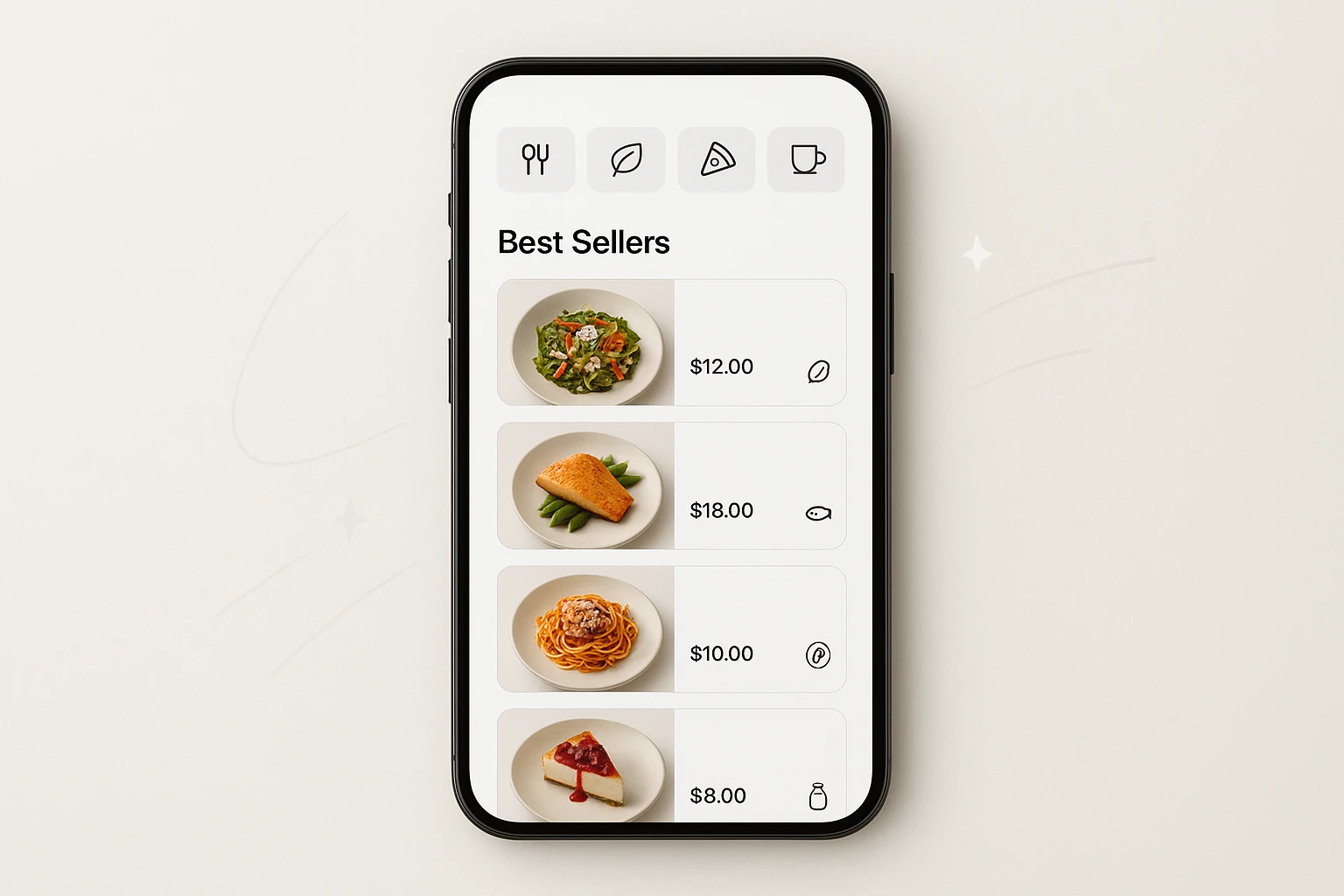
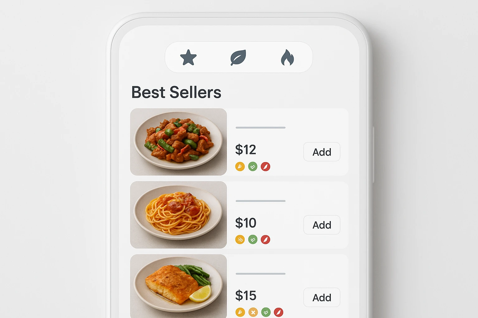
- Sticky category chips (horizontally scrollable). Keep visible: Best Sellers, New, Dietary (GF, V, DF), and 4-8 core categories. Cap at 10 chips before collapsing to “More.”
- Category thumbnails: small 64-96 px images that preview the category vibe (e.g., pasta, bowls, tacos). Use consistent background and plate size so differences are legible.
Card layout that helps people choose
- Each card shows five elements: 1) thumbnail (256-320 px), 2) name + price, 3) 1-line benefit (“Crispy double smash, dill pickles”), 4) quick tags (GF, V, SPICY), and 5) an add button.
- Variants as options, not separate items. E.g., “Size: 8/12 oz” or “Protein: chicken/tofu.” This keeps the menu short.
AI-styled images to reduce choice overload
- Consistency is the unlock. Use a single branded environment: same angle (e.g., 45?), neutral surface, soft daylight. When scale, plate, and lighting match, differences-sauce color, toppings, portion-stand out. Diners compare faster.
- Generate 2-3 style variants with Yummify (bright & clean, rustic, dark & moody). A/B test thumbnails for 2 weeks; keep the winner, then upgrade to high-res only for top sellers.
Honest visuals + allergen clarity
- Photograph or generate the default build only. If nuts or sesame are optional, don’t show them on the main image; add a secondary image or callout for the add-on.
- Place allergen tags next to price and color-code subtly (e.g., NUTS = amber). Tap to view full allergen details. Ensure images match the tag reality.
Two quick wins: pin Best Sellers at the top (3-6 items) and limit category size to 12-16 items before requiring a tap into a subcategory.
Summary: Use sticky chips, category thumbnails, and decision-first cards to improve QR menu UX. AI-styled, consistent images make differences pop and choices faster-without misleading.
Case studies: 3 rollouts with numbers
- BrightSide Cafe (40-seat, downtown). Problem: 6.2 MB PDF, slow on LTE; vegan items buried. Action: Migrated to HTML cards with sticky chips; generated consistent thumbnails for 38 dishes using Yummify’s branded environment in one afternoon. Results (hypothetical but realistic):
- Initial load: 4.6s -> 1.8s by compressing images to 80-140 KB and lazy-loading below-the-fold.
- Time-to-first-tap: 31s -> 19s (observational sample of 50 sessions).
- Orders completed per 100 scans: 34 -> 40 (+17.6%). Average order value (AOV): $16.90 -> $17.80 (+5.3%).
- Ghost kitchen burger brand (delivery-only). Problem: Low DoorDash conversion; inconsistent photos from different weeks. Action: Generated 3 style variations per burger (bright & bold vs. neutral vs. dark & moody) and rotated weekly. Winners were upgraded to high-res via Yummify. Results over 3 weeks:
- Best-performing style lifted add-to-cart rate from 10.2% to 12.9% (+2.7 pts) while keeping image weight under 180 KB via WebP.
- Re-shoot cost avoided: ~$1,800 (traditional photographer and stylist) vs <$50 in Yummify credits for testing.
- Taco shop near a stadium. Problem: Allergy incidents on game days; guests expected limes because photos showed them. Action: Regenerated images to reflect default builds (no limes), added “Add Lime Wedges +$0.50” as an option, and placed NUTS/DAIRY tags next to price. Results:
- Support messages for “missing limes” dropped from 22 to 3 per game day.
- Refunds due to allergen confusion cut from 6 to 1 per week.
These rollouts shared a playbook: consistent image language, visible filters, honest visuals, and lightweight assets that define great QR menu UX. The mechanism is simple: reduce friction per decision, and more decisions become orders.
Summary: Three realistic scenarios show faster loads, clearer choices, and fewer complaints-powered by consistent AI-styled images and better QR menu UX layout.
Implementation guide: build your high-converting QR menu
Follow this 8-step plan. Total time: 1-2 afternoons for a 30-50 item menu.
- Define categories and chips
- Keep 4-8 primary categories plus Best Sellers and Dietary. Cap total chips at 10 before using “More.”
- Limit each category to 12-16 items; move variants into options.
- Create a thumbnail system
- Sizes: category thumbnails at 64-96 px; dish thumbnails at 256-320 px on mobile.
- Composition: 45? angle, neutral surface, same plate size, 30-40% negative space. Use Yummify branded environments to lock this in.
- Generate images with Yummify
- Upload your reference shots (window light, sharp focus) or use text prompts. Generate at standard quality first (under 60 seconds per image typical), then create 2-3 style variations for top items.
- Use Prompt Enhancement to add detail (e.g., “sesame-free default build”).
- Speed checklist (target under 2s on LTE)
- Export thumbnails at 80-140 KB (WebP/AVIF), detail images at 180-320 KB.
- Use srcset: 200w, 400w, 800w; lazy-load below-the-fold; preload first 6 thumbnails.
- Serve via CDN; cache for 7-30 days with versioned URLs; ship a skeleton UI while images load.
- Honest visuals + allergen clarity
- Show default builds only. If an allergen is optional, omit it in the main photo; show as selectable add-on.
- Tag next to price: GF, V, DF, NUTS, SESAME, EGG, SHELLFISH. Tap reveals full list and cross-contact note.
- Copy discipline
- 1-line benefit, 80 characters max. Price visible without tap. No paragraph blocks on cards.
- A/B test for 2 weeks
- Test two image styles per best seller. Promote the winner and upgrade to high-res in Yummify.
- Maintain monthly
- New seasonal? Generate and publish the same day. Audit for mismatches (garnishes, buns, portion) and regenerate as needed.
Summary: Use a capped chip set, standardized thumbnails, fast assets, and honest allergen visuals to optimize QR menu UX. Generate fast in Yummify, test, then upgrade winners.
Next steps
Turn your QR menu into a fast, honest, decision-friendly storefront in one afternoon and deliver excellent QR menu UX. Start by creating a Yummify branded environment that matches your vibe (bright & clean or rustic), then generate standard-quality thumbnails for your top 20 items. Run a two-week A/B test on 2-3 styles for your best sellers, keep the winner, and upgrade only those images to high resolution. You’ll cut production time from weeks to hours, keep visuals aligned with reality, and make choices effortless for guests. Try Yummify free on your next menu update-upload a few reference photos and see styled results in minutes.
FAQ
Can I use my own photos as a starting point?
Yes. Upload iPhone shots with decent window light and sharp focus. Yummify validates that images are food and then styles them within your branded environment. If your photo shows an optional allergen, regenerate an image of the default build. You can also start from text if you don’t have a good photo.
How does this compare to hiring a photographer?
Traditional shoots run $150-300 per dish and take 2-4 weeks to schedule and edit. Yummify generates styled images in minutes and lets you test multiple looks affordably, then upgrade only the winners. Many teams still hire a photographer quarterly for a few hero shots and use Yummify for day-to-day menu upkeep that improves QR menu UX. It’s about speed, consistency, and iteration rather than replacing craft.
What if my food doesn’t photograph well?
Shoot near a window, turn off harsh overheads, and keep the lens clean; that’s usually enough for a solid reference. If the dish still doesn’t read well, generate from a text prompt with Yummify’s Prompt Enhancement-it adds detail that improves output. You can also simplify the plating in the image so the main ingredient stands out. Test two compositions and keep the clearer one.
Do I need special equipment or a designer?
No special gear. An iPhone/Android camera and 30 minutes to learn your menu builder are enough. For assets, export WebP/AVIF, use responsive srcset, and lazy-load below-the-fold to maintain fast menu loading speed. Yummify handles styling consistency; your team plugs images into your QR platform’s card layout.
How fast can I go from photo to live menu?
Same-day is realistic. Generate standard-quality images in minutes, publish, and monitor. When an image clearly outperforms, upgrade that file to higher resolution in Yummify without redoing the set. A 30-50 item menu typically takes 1-2 afternoons to refresh end to end.
How do I keep allergen visuals honest as recipes change?
Always show the default build in images and list allergens next to the price. If a recipe changes (e.g., sesame bun -> brioche), regenerate images that match the new default. Maintain a change log: date, dish, allergen impact, and image version. This prevents mismatches and avoids refund requests.
Will AI images look fake to guests?
Consistency beats hyper-realism for menus-same angle, plate, and lighting help people compare quickly. Yummify’s branded environments keep images professional yet believable, and you can calibrate style intensity. If your audience prefers a natural look, choose bright, neutral settings and minimal props. Test two styles side by side for two weeks and keep the one with higher add-to-cart.
Related posts
15 Creative Food Photography Ideas to Make Your Dishes Stand Out
Discover creative food photography ideas to make your dishes stand out. Learn action shots, deconstructed dishes, unique angles, storytelling, and AI tools for stunning food visuals.
Beyond Burgers: AI Food Styling for Diets and Cuisines
Use AI food styling to create accurate vegan, gluten-free, halal, kosher, and global cuisine photos that convert across delivery apps, QR menus, and social.
Close the Loop: Tie Food Imagery to Analytics and Sales
Stop guessing which food photos work. Learn a simple workflow to tie Yummify images to analytics, A/B test visuals, and promote only the photos that actually sell.