10 Food Photo Mistakes (and AI Fixes) for Restaurants
Introduction: The 10 mistakes that quietly kill orders
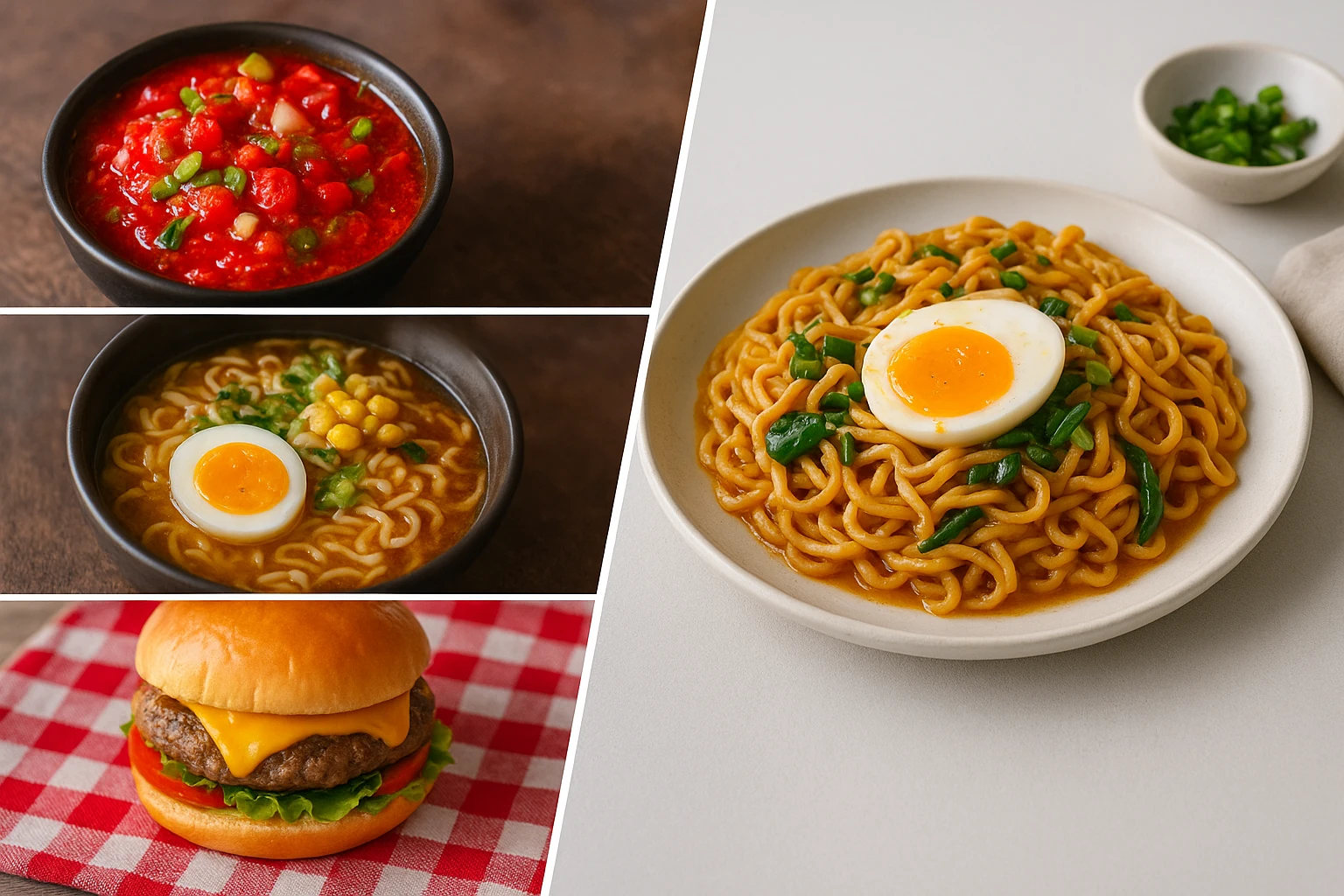
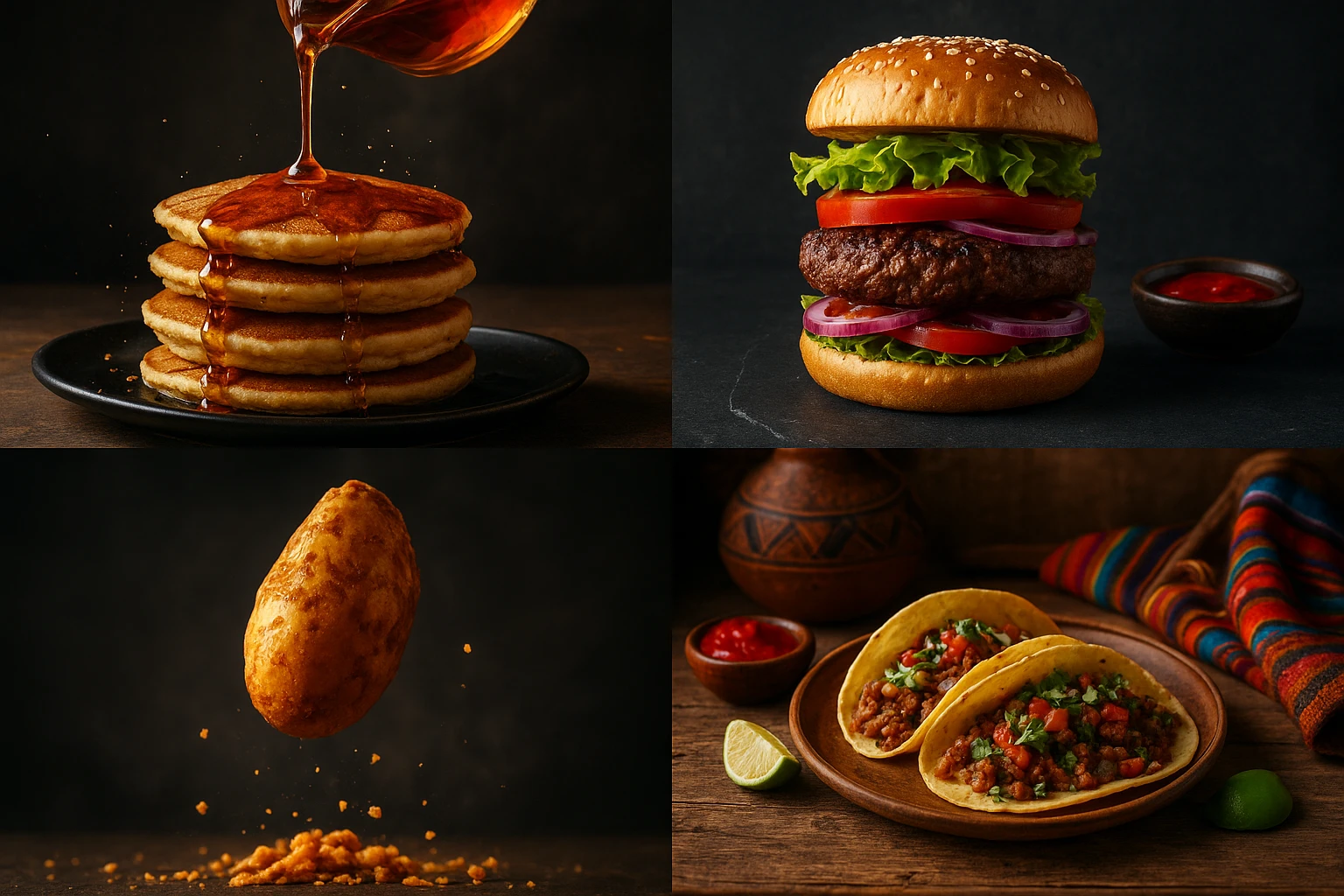
You’re updating a menu on DoorDash at 10 p.m. The chef texts you iPhone photos. You upload them, hoping for the best. The burrito looks neon-red. The pasta has a blinding highlight from a ceiling bulb. The burger is cropped so tight you lost half the bun. By morning, orders dip versus last week. Not because the food changed-your photos did.
This guide lists 10 common food photo mistakes and shows the exact AI fixes and quick retakes for each. The focus is practical: use Yummify to generate clean, on-brand images in minutes, not weeks. Traditional shoots can run $3,000-6,000 for a 20-dish menu and take 2-4 weeks. With a Yummify subscription, you can iterate same day. Upload a reference photo or start from a text prompt. Apply your branded environment and generate multiple versions. Upgrade only the top performers.
What you’ll get here:
- The specific pitfall (over-saturation, glare, bad cropping)
- A quick AI adjustment in Yummify
- A fast retake tip for your phone near a window
By the end, you’ll have a checklist your team can run in under an hour to clean up existing photos and create consistent new ones without booking a studio.
Summary: We set up a realistic scenario and preview 10 concrete mistakes with AI fixes and quick retake tips you can use today.
Color + Light: Over-saturation and glare (Mistakes 1-2)
Mistake 1 - Over-saturation or color cast
- Problem: Reds go nuclear, greens look radioactive, or the entire dish skews yellow from warm bulbs. This misrepresents freshness. It reduces trust.
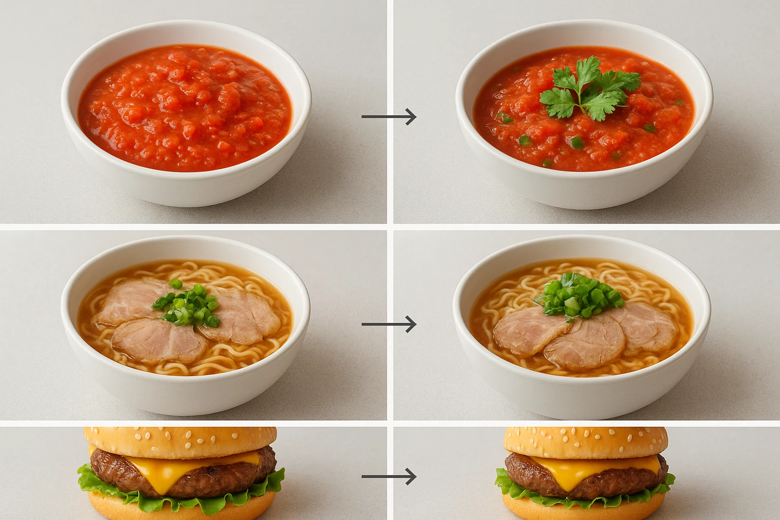
- Quick AI fix in Yummify: Upload your reference photo and select your Branded Environment with natural, daylight-balanced lighting. In Prompt Enhancement, include “true-to-life saturation, neutral white balance, natural reds and greens.” Generate 4 versions; pick the most accurate. If starting from text, specify “neutral white balance, no color cast.”
- Retake tip: Shoot near a window during the day. Turn off indoor bulbs. Place dish 45-90 cm from the window and a white napkin opposite the light to bounce fill.
Example 1 (hypothetical): An Austin salsa bar’s oversaturated roja looked fluorescent. These food photo mistakes with color are common and easy to fix. With the above prompt and environment, the AI produced natural tomato reds and cilantro greens. After swapping images on DoorDash, they saw an 8% lift in add-to-cart over two weeks versus the prior image.
Mistake 2 - Glare and harsh highlights
- Problem: Glossy sauces and soups blow out to white patches; metallic cutlery reflects hotspots.
- Quick AI fix in Yummify: Use an environment with “soft, diffused daylight, low specular highlights.” Prompt Enhancement: “no blown highlights, even contrast, gentle sheen only.” Regenerate.
- Retake tip: Put a thin paper towel or translucent bag between window and dish to diffuse light; remove reflective props.
Example 2 (hypothetical): A ramen shop’s chashu glare hid the marbling. Diffused-light environment + “no specular highlights” prompt recovered texture. Proper food photo mistakes correction takes seconds; standard-quality generation took ~60 seconds.
Summary: Fix unnatural color and glare with daylight-balanced styling, diffused-light environments, and simple window-light retakes.
Framing + Background: Crops and clutter (Mistakes 3-4)
Mistake 3 - Bad cropping and amputations
- Problem: Food photo mistakes like tight crops cut off buns, bowls, or key toppings. Delivery apps often auto-crop to square, worsening the issue.
- Quick AI fix in Yummify: Generate with crop-safe guidance in your Branded Environment: “centered plate, 10-15% margin, 1:1 safe area.” Use the square output for delivery listings and 4:5 for Instagram. Generate 3-5 variations; select the one with clean margins.
- Retake tip: Shoot slightly wider than you think. Leave at least a two-finger margin around the plate. Keep the plate centered.
Example 1 (hypothetical): A burger spot kept losing the top bun in app thumbnails. With crop-safe prompts and 1:1 output, the full burger stayed visible. Good restaurant food photography prevents these issues. Click-through on the burger item improved 6% week over week.
Mistake 4 - Busy background and prop clutter
- Problem: Common food styling errors like loud tablecloths, branded napkins, and five utensils pull the eye from the food.
- Quick AI fix in Yummify: Select a minimalist Branded Environment: “neutral matte surface, subtle texture, no branded clutter.” Prompt Enhancement: “single hero plate, minimal props, muted background.”
- Retake tip: Use a plain baking sheet or unpatterned cutting board; one prop max (e.g., a folded linen).
Example 2 (hypothetical): A meal-kit company’s marinade bowl competed with a loud checkered cloth. The AI minimal environment removed the distraction. Modern AI food photography handles backgrounds cleanly. An A/B test across 1,000 sessions showed a 9% higher detail-page click when the clutter was removed.
Summary: Use crop-safe generations and minimalist backgrounds to keep the whole dish in frame and attention on the food.
Focus + Depth: Blur and flatness (Mistakes 5-6)
Mistake 5 - Soft focus or overall blur
- Problem: Among food photo mistakes, texture (sear, crumb, grill marks) looks mushy; customers can’t “taste with their eyes.”
- Quick AI fix in Yummify: In Prompt Enhancement, specify “crisp micro-texture, high clarity on hero area, subtle noise reduction.” Choose a Branded Environment that favors clarity and edge definition.
- Retake tip: Tap to focus exactly where you want attention (e.g., cut edge of steak). Avoid digital zoom; step closer instead. Brace your elbows on the table to reduce shake.
Example 1 (hypothetical): A steak frites image looked soft end-to-end. Avoiding common food photo mistakes helps. The AI regenerated with emphasis on the steak’s cut face. Sharper texture helped the image outperform the old one by 12% in a 7-day special promo.
Mistake 6 - Wrong depth-of-field (DOF)
- Problem: Everything in focus feels flat; too shallow loses context and looks artsy but unhelpful.
- Quick AI fix in Yummify: Prompt Enhancement: “shallow DOF at f/2.8 look, hero subject sharp, background softly blurred, readable sides.” Regenerate 3-4 options and choose the most legible.
- Retake tip: Place the camera 30-45 cm from the dish at a 30-45? angle. Ensure the hero element (e.g., first taco) is closest to the camera.
Example 2 (hypothetical): A three-taco set looked flat with infinite focus. After specifying shallow DOF, Yummify produced a version with the front taco sharp and the rest gently blurred. These food photo mistakes results speak volumes when corrected effectively.
Summary: Dial in clarity and depth so texture pops without losing context: crisp focus on the hero and controlled blur everywhere else.
Styling + Accuracy: Misleading portions and lifeless food (Mistakes 7-8)
Mistake 7 - Inaccurate portions or topping placement
- Problem: Food photo mistakes involving delivery app images that overpack toppings or show a different sauce ratio than served trigger complaints. This also leads to refunds.
- Quick AI fix in Yummify: Start with a current reference photo of the real portion. In Prompt Enhancement, include specifics: “12-inch tortilla, 120g chicken, medium pico distribution, 6 basil leaves, light drizzle only.” Use the same Branded Environment you’ll use for the rest of the menu to keep things honest and consistent.
- Retake tip: Plate exactly as served; measure if needed. Align the dish to match your best-selling orientation.
Example 1 (hypothetical): A pizzeria’s image showed dense basil that guests didn’t receive. Regenerating with accurate basil count and placement cut “not as pictured” comments in half over a month.
Mistake 8 - Dull, dry-looking food (no gloss or warmth)
- Problem: When food photo mistakes include styling issues, fries look stale, glazes look matte, soups look cold.
- Quick AI fix in Yummify: Prompt Enhancement: “freshly plated appearance, subtle sheen on sauces, warm highlights, gentle steam where appropriate.” Choose an environment with warm but neutral daylight tones.
- Retake tip: Photograph within 3 minutes of plating. For non-soggy items, a light brush of neutral oil on glazes can add natural sheen; avoid overdoing it.
Example 2 (hypothetical): A stir-fry looked flat and dry. The AI added a gentle gloss and hint of steam. The refreshed image increased add-on orders for the combo meal by 10% compared to the previous week.
Summary: Keep images honest and appetizing: match real portions and add realistic warmth and sheen so food looks fresh, not fake.
Consistency + Format: Mismatched looks and wrong ratios (Mistakes 9-10)
Mistake 9 - Inconsistent style across your menu
- Problem: Food photo mistakes like one dish being dark and moody while another is bright and airy. On a grid page, it looks like three different brands.
- Quick AI fix in Yummify: Create one Branded Environment (e.g., “Rustic Cantina: warm terracotta, diffused daylight, matte surface, 3/4 angle”). Apply it to all dishes. Generate in batches; reject anything off-style and regenerate.
- Retake tip: When capturing references, keep angle and distance consistent. A simple cheat: mark a spot for the plate and a spot for the phone on your counter.
Example 1 (hypothetical): A 12-location poke brand standardized on a bright, clean environment. They generated 36 images (3 per dish) in an afternoon, then upgraded the top 12 to high quality for their website. Turnaround: under 24 hours versus 2-3 weeks to schedule a shoot.
Mistake 10 - Wrong aspect ratio and size for platforms
- Problem: When food photo mistakes involve format, a 16:9 banner crops badly in 1:1 app tiles. Text then overlaps key food areas.
- Quick AI fix in Yummify: Output platform-specific ratios: 1:1 for delivery apps, 4:5 for Instagram feed, 16:9 for website headers. Generate at standard quality first; upgrade only the winners.
- Retake tip: Compose with safe zones-keep food centered with 10-15% margin so auto-crops don’t cut key elements.
Example 2 (hypothetical): A cafe’s 16:9 latte photo got chopped in a 1:1 tile, hiding latte art. Square-specific generation with margin preserved the art and reduced image-related support pings from franchisees.
Summary: Lock consistency with one branded style and output the right ratio for each platform. Generate fast, upgrade only what wins.
Next steps
Ready to fix your menu photos in an afternoon? Try Yummify free This food photo mistakes approach works well. Upload a reference shot to Yummify, select or create a Branded Environment, and generate 3-5 versions per dish at standard quality. Replace your worst offenders first: over-saturated reds, glare-heavy soups, and tight crops. Track results for 7-14 days on your delivery apps, then use Quality Upgrades on the top performers for website and print. No studio, no waiting-just honest, appetizing images that match how you actually serve the dish.
FAQ
Can I use my own photos, or do I have to start from text prompts?
You can do either. Many restaurants start with quick phone shots near a window, then use Yummify to generate polished versions in a consistent style. If you don’t have a good reference, describe the dish and your brand look; Prompt Enhancement expands your description into a production-ready prompt. You can also mix approaches: upload photos for hero items, use text-only generations for seasonal LTOs.
How does this compare to hiring a photographer for a full shoot?
Traditional shoots deliver excellent craft but require scheduling, a stylist, and higher budgets-often $3,000-6,000 for 20 dishes with 2-4 weeks lead time. Yummify excels when you need speed, volume, and consistency across many items or locations. Many brands use both: AI for menus, delivery tiles, and social volume; a photographer for quarterly hero campaigns. The key advantage is rapid iteration-you can generate dozens of options the same day.
Do I need special equipment to get good results?
No. A recent iPhone or Android camera is fine. Shoot near a window with indoor lights off, hold the phone steady, and leave extra margin around the plate. Those basics give Yummify enough detail to generate clean, professional-looking images. If you have a small white board or napkin, use it as a reflector to soften shadows.
What if my food doesn’t photograph well-like glossy soups or shiny glazes?
Use a diffused-light Branded Environment and prompts that minimize specular highlights. Retake near a window with a diffuser (paper towel works in a pinch) and remove reflective props. Tell Yummify “no blown highlights, gentle sheen only.” For reference images, a 3-minute window post-plating helps retain natural gloss without melting toppings.
How long does it take to learn and get results?
Most users generate usable images in their first session. A practical workflow is: upload a reference, choose your Branded Environment, click Prompt Enhancement, generate 4 versions, and pick the best. The first batch typically takes minutes. After you build one environment you like, applying it to the rest of the menu is straightforward.
Can I keep color consistent across franchise locations?
Yes. That’s what Branded Environments are for. Define your color temperature, surface, angle, and contrast once, and apply it across all dishes. Even if each location uploads different reference photos, the environment keeps the results aligned, reducing the “three different brands” look on aggregator pages.
When should I use Quality Upgrades?
Generate everything at standard quality first to test multiple looks quickly. Upgrade only your winners—top performers on delivery apps or hero shots for your website and print. This keeps costs predictable while ensuring your best visuals get the extra resolution they deserve.
Related posts
15 Creative Food Photography Ideas to Make Your Dishes Stand Out
Discover creative food photography ideas to make your dishes stand out. Learn action shots, deconstructed dishes, unique angles, storytelling, and AI tools for stunning food visuals.
Beyond Burgers: AI Food Styling for Diets and Cuisines
Use AI food styling to create accurate vegan, gluten-free, halal, kosher, and global cuisine photos that convert across delivery apps, QR menus, and social.
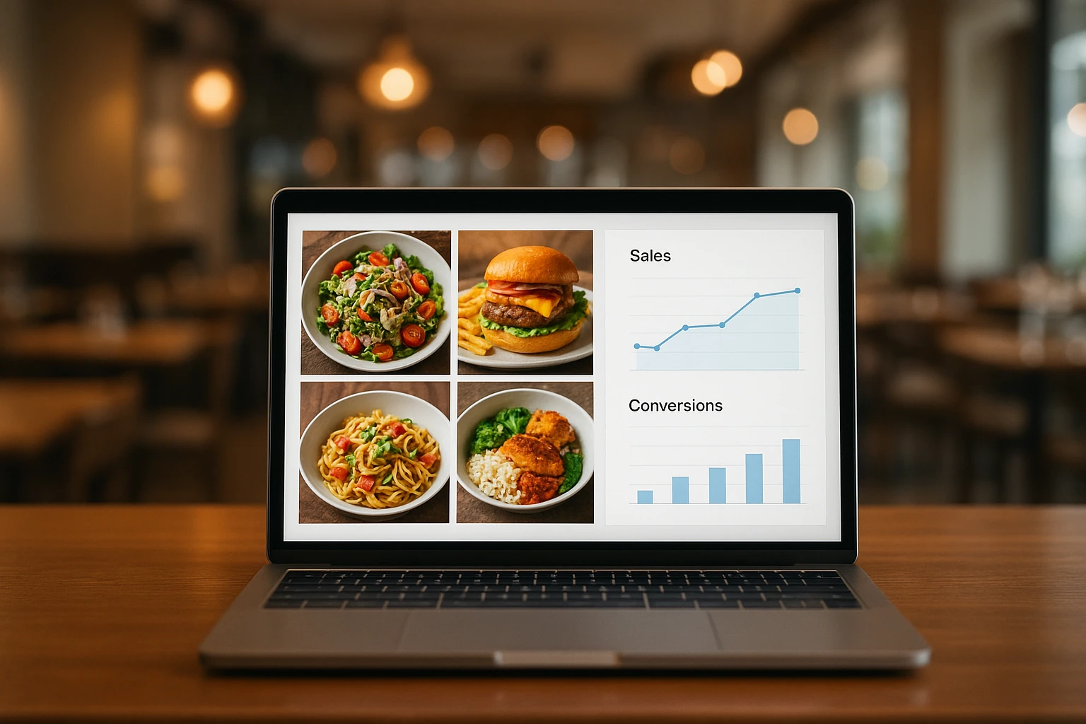
Close the Loop: Tie Food Imagery to Analytics and Sales
Stop guessing which food photos work. Learn a simple workflow to tie Yummify images to analytics, A/B test visuals, and promote only the photos that actually sell.