Food Stylist Secrets: Style Food Like a Pro Guide

Quick navigation:
Mastering the Basics of Plating and Composition
Professional food presentation begins with arranging elements to create visual appeal. Every experienced food stylist knows that arrangement affects appetite and perception. The fundamental principles include balance, contrast, and thoughtful use of negative space. These are the areas of the plate left intentionally empty to let the food shine.
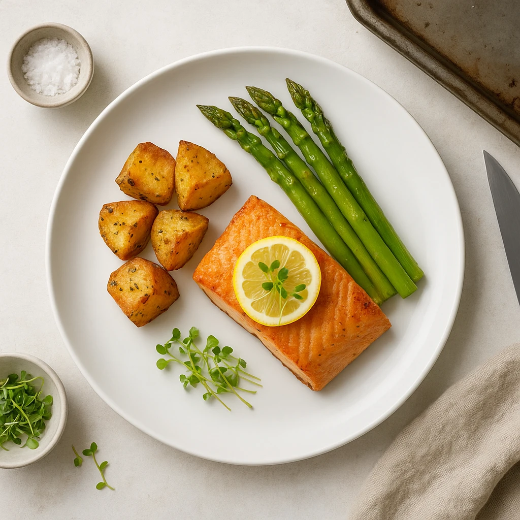
Classic plating techniques include the clock method. Proteins sit at 3-4 o’clock, starches at 9-10 o’clock, and vegetables fill the remaining space. Another approach is the quadrant method, dividing the plate into four equal sections. Modern arrangements often favor asymmetrical compositions. These feel more dynamic and artistic, drawing the eye across the plate.
The choice of plate matters significantly. White plates provide neutral backgrounds that let colors pop. Dark plates create dramatic contrast. According to Auguste Escoffier School of Culinary Arts, plate size and portion size create visual hierarchy. Larger plates with smaller portions feel elegant. Crowded plates appear less refined [https://www.escoffier.edu/blog/culinary-arts/a-guide-to-plating-and-food-presentation/].
Height and dimension add sophistication. Building components upward rather than spreading them flat creates visual interest. You might stack protein atop starch, or use ring molds to create neat cylindrical portions. Sauces can be spooned in deliberate patterns rather than poured haphazardly. Each placement decision affects how viewers perceive care and quality.
Texture contrast through plating makes dishes more compelling. Combine crispy, smooth, and chunky elements. A successful plate tells a story through arrangement. It guides the viewer’s eye through complementary flavors and textures. When applying these techniques, you can style food like a pro. Every element placement should feel intentional, creating a composition that feels appetizing and professional.
| Plating Technique | Description | Best For |
|---|---|---|
| Clock Method | Components placed by time on clock face | Traditional American cuisine |
| Quadrant | Plate divided into four equal sections | Modern tasting menus |
| Free-Style | Asymmetrical, artistic arrangement | Fine dining, social media |
| Stacked/Vertical | Components built upward for height | Burgers, layered dishes |
| Sauce Swirls | Deliberate patterns with squeeze bottles | Plate enhancement, color contrast |
The Art of Garnishing and Sauce Placement
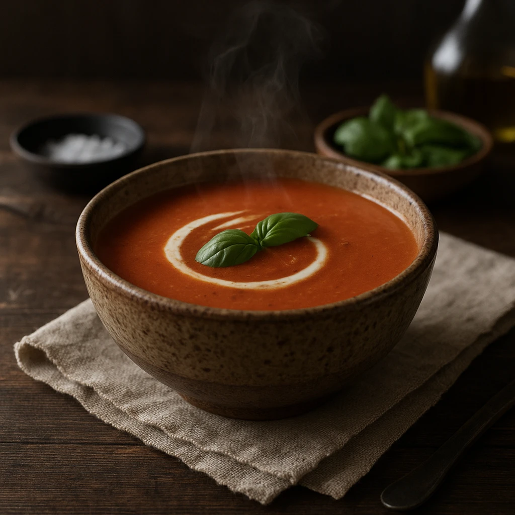
Garnishing represents one of the most powerful techniques in a styling professional’s arsenal. It transforms ordinary dishes into visually stunning presentations. The key lies in restraint and relevance. Garnishes should complement flavors, not distract from them. Fresh herbs like microgreens, basil chiffonade, or thyme sprigs add color contrast. They avoid overwhelming the main dish. Edible flowers, citrus zest, and spice dusts provide finishing touches that signal attention to detail.
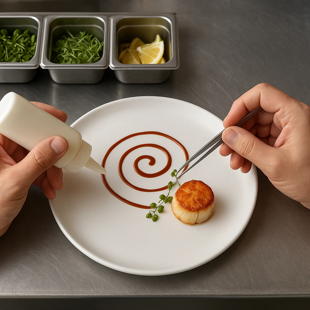
Sauce placement deserves equal consideration. Rather than pouring sauce over everything, use squeeze bottles to create deliberate patterns. Place them underneath proteins or alongside sides. WebstaurantStore’s food photography guide emphasizes intentional placement [https://www.webstaurantstore.com/guide/914/food-photography-tips.html]. Sauces can create visual flow and color contrast. Techniques include the classic swoosh, dot patterns, or geometric shapes.
The right garnish depends on the dish’s color palette. Green herbs pop against red sauces and proteins. White dishes benefit from colorful fruit or vegetable accents. Acidic elements like citrus wedges or pickled vegetables provide visual contrast and flavor balance. Complementary colors create vibrancy. Monochromatic schemes feel sophisticated and minimalist.
Texture plays a crucial role in garnishing. A smooth soup might benefit from crunchy croutons, herb oil drizzles, or spiced cream dollops. A protein dish gains visual interest from crispy shallots, toasted nuts, or fried herb clusters. Consider mouthfeel alongside appearance. Garnishes should contribute to eating experience, not just decoration.
Tools make precise garnishing easier. Tweezers allow exact herb placement. Offset spatulas create smooth sauce surfaces. Ring molds help compose neat stacks. Small squeeze bottles provide control over sauce patterns. Investing in these basic tools elevates home presentations to near-professional levels.
When applying garnishing principles, remember that less is often more. A single perfect basil leaf makes more impact than a handful of randomly placed herbs. Thoughtful garnish placement signals care and professionalism. These are key qualities that every styling expert aims to communicate.
Garnish Selection by Dish Type
| Dish Category | Ideal Garnishes | Placement Strategy |
|---|---|---|
| Soups | Cream dollops, herb oils, croutons, chiffonade | Center top or floating in pattern |
| Proteins | Herb sprigs, citrus, compound butter | Leaning against protein or on side |
| Salads | Edible flowers, nuts, seeds, cheese | Sprinkled throughout or clustered top |
| Desserts | Powdered sugar, mint, fruit coulis | Dusting, drizzling, or deliberate placement |
| Pasta | Cheese wheels, fresh basil, parsley ribbons | Mounded on top or tucked into folds |
Creating Steam, Texture, and Freshness
Capturing steam in food photography signals freshness and temperature. It makes dishes appear more appetizing. Skilled professionals have developed numerous techniques to create steam effects. For hot foods, timing matters. Photograph immediately after cooking while steam naturally rises. For food that cools quickly, try cotton balls soaked in hot water hidden behind the dish. Microwaved water-soaked tampons positioned out of frame also work. Commercial steamers positioned just off-camera provide another option.
Cold foods present different challenges. Ice cream melts quickly under hot studio lights. You might use mashed potatoes colored with food coloring as a stand-in. They hold shape longer. For beverages with condensation, a spray bottle filled with water and corn syrup creates realistic droplets. These don’t run as quickly as plain water. A light coating of vegetable oil or glycerin on cold drinks produces appetizing sheen and bead patterns.
Texture enhancement makes food look more appealing and freshly prepared. Adobe’s food photography guide notes that brushing proteins with oil creates appetizing shine [https://www.adobe.com/creativecloud/photography/discover/beginner-guide-food-photography.html]. Spritzing salads with water revives wilted leaves. Toasting or blow-torching surfaces creates caramelized color variation. Use tweezers to reposition sesame seeds, cheese shreds, or herbs for optimal coverage.
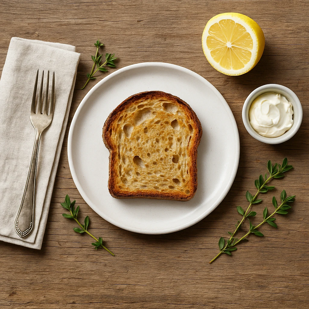
Freshness indicators matter significantly. Green vegetables should look vibrant, not olive-drab. A quick blanch in boiling water followed by an ice bath resets colors. Berries benefit from a light water spritz to appear freshly picked. Bread gains appetizing sheen from egg wash or butter application before final toasting. These techniques help food appear at its peak.
Steam effects vary by food type. Soups and hot beverages show columnar steam rising vertically. Solid proteins might have wisps rising from multiple points. Stir-fries benefit from steam combined with oil sheen. This suggests both heat and sizzle. Select appropriate steam technique based on what you’re photographing.
For DIY work without specialized equipment, simple household items work remarkably well for diy food styling. A tea kettle provides steam when positioned behind food. Cooking spray adds shine to proteins and vegetables. A makeup brush applies oil or sauces precisely. Small tweezers reposition garnishes. These accessible tools mean anyone can apply professional techniques at home.
Creating realistic freshness requires understanding how food behaves naturally. Overdoing steam or shine makes food look artificial. The goal is enhancement, not transformation. Study what fresh, hot food actually looks like. Apply subtle techniques that amplify those qualities without appearing obviously styled.
Steam & Freshness Technique Quick Reference
- Hot Food Steam: Photograph within 2 minutes of cooking, or use cotton balls soaked in boiling water hidden behind food
- Beverage Condensation: Mix 3 parts water with 1 part corn syrup in spray bottle, spray chilled glass exterior
- Protein Shine: Lightly brush with neutral oil using pastry brush, focus on high points and seared surfaces
- Vegetable Color Revival: Blanch greens 30 seconds in boiling water, immediately transfer to ice bath for 2 minutes
- Bread Freshness: Apply egg wash or melted butter, finish with 2-3 minutes under broiler for golden color
Selecting Props and Applying Color Theory
Props and background choices significantly impact food photography quality. They set the mood and support the story each dish tells. An expert approaches prop selection thoughtfully. Consider how textures, colors, and materials complement the food rather than compete with it. The goal is directing attention to the dish while creating an appealing composition.
Prop categories include surfaces, linens, utensils, and complementary food elements. Surfaces range from rustic wood to sleek marble to textured slate. Linens add softness. Crisp white napkins suggest refinement, while checked or patterned fabrics create casual comfort.
Utensils should match the food type and desired aesthetic. Elegant silver works for fine dining. Vintage flatware provides rustic charm. Modern minimalist cutlery suits contemporary styles. Christina Greve, a professional food photographer, emphasizes that props should support rather than overshadow the main subject [https://www.christinagreve.com/food-styling-and-food-photography-cheat-sheet/].
Color theory application elevates presentations beyond mere arrangement. Complementary colors are opposites on the color wheel. They create vibrant contrast. Orange carrots pop against green herbs. Red tomato stands out against green basil. Analogous colors are neighbors on the wheel. They create harmonious, sophisticated palettes. Various green vegetables together feel cohesive and fresh. Triadic color schemes use three evenly spaced colors for dynamic compositions.
The 60-30-10 rule provides a simple framework for color balance. Sixty percent of the frame should be the dominant color, typically the plate or background. Thirty percent represents the secondary color, often the main food component. Ten percent serves as accent color for garnishes and small elements. This proportion creates pleasing balance without overwhelming viewers.
Props should feel authentic to the food type and setting. An Italian pasta dish might feature checked tablecloths, ceramic bowls, and rustic bread. Asian noodles work with bamboo surfaces, chopsticks, and patterned textiles. Consider cultural context alongside aesthetics. Props should feel appropriate, not randomly chosen.
Texture variety through props adds visual depth. Smooth plates contrast with rough wood surfaces. Metallic utensils provide reflective shine against matte backgrounds. Soft linens balance hard ceramic dishes. This interplay keeps compositions visually interesting and guides the eye through different elements.
When building a prop collection, start with versatile basics in neutral colors. White plates of various sizes, wood surfaces, linen napkins, and simple silverware form a flexible foundation. Add specialty props gradually based on the food types you typically photograph. Thrift stores, restaurant supply stores, and home goods retailers offer affordable options.
Lighting interacts with props in crucial ways. Shiny surfaces reflect light and can create unwanted highlights. Matte surfaces absorb light, providing neutral backdrops. Test props under actual lighting conditions before shooting to prevent unwelcome surprises. Different materials respond to light differently, so choose accordingly.
Color Theory Quick Reference for Food Styling
| Color Harmony | Description | Food Example |
|---|---|---|
| Complementary | Opposite colors on color wheel (high contrast) | Caprese with red tomato and green basil |
| Analogous | Adjacent colors (harmonious) | Grain bowl with various green vegetables |
| Monochromatic | Single color, varying shades | Different mushroom varieties together |
| Triadic | Three evenly spaced colors (balanced) | Salad with greens, orange carrots, purple cabbage |
| Split-Complementary | Base color plus two adjacent to complement | Green pesto pasta with red tomatoes and warm bread |
Using AI Tools for Professional Food Styling
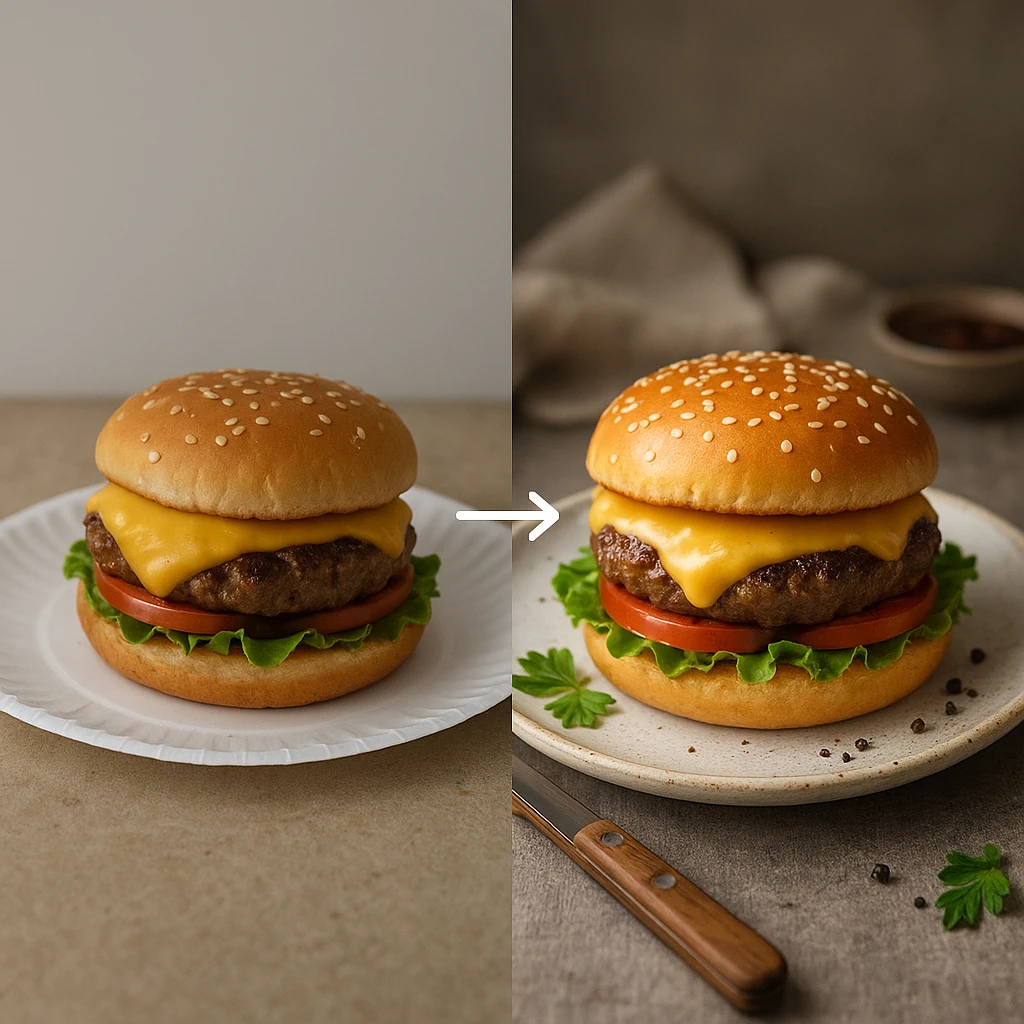
Artificial intelligence has transformed food photography. Professional-quality results are now accessible without hiring a specialist or investing in expensive equipment. Modern AI platforms analyze uploaded images or text descriptions. They generate beautifully styled food photographs using techniques that traditionally required years of training. Restaurant owners, food bloggers, and marketers can now produce stunning visuals in minutes.
AI food styling tools work through sophisticated image generation models trained on thousands of professionally photographed dishes. Users can upload a reference photo showing their actual food. Alternatively, they can simply describe what they want to create.
The AI then generates new versions applying professional principles. These include lighting enhancement, color correction, composition improvement, and atmospheric effects that make food look appetizing. Flair.ai’s guide to AI food photography explains how these tools apply principles like depth of field, color grading, and texture enhancement automatically [https://flair.ai/blog/how-to-create-stunning-ai-food-photography-that-wows-diners].
The workflow typically begins with either a reference photo or a detailed text prompt. Reference photos work well when you have a specific dish but lack photography skills or equipment. Text prompts allow creating entirely new concepts without original photography. This makes professional styling accessible to anyone.
The AI analyzes input to understand food type, plating style, and desired aesthetic. It then generates multiple variations for selection and refinement.
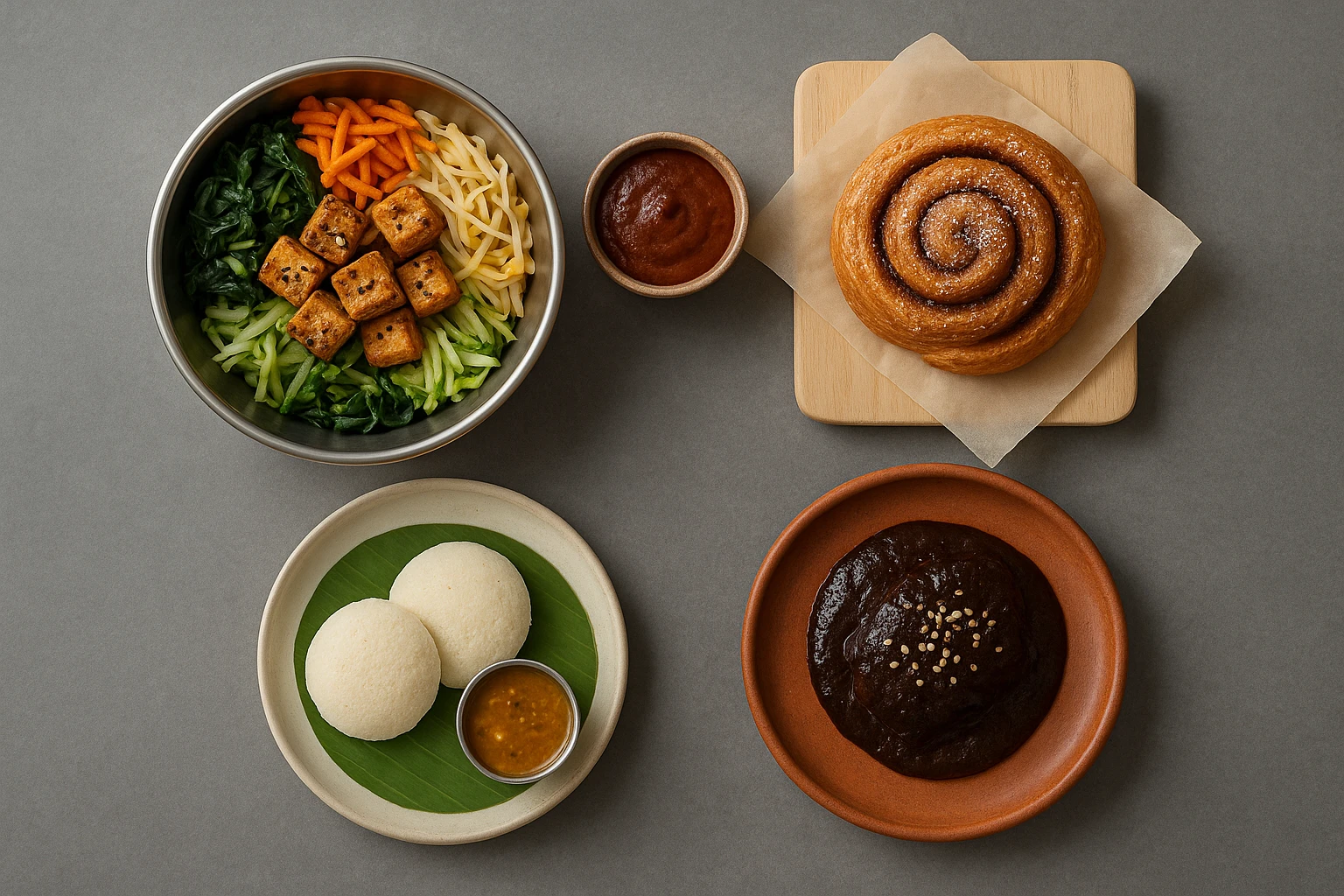
Branded environment features offer a significant advantage for businesses needing consistent imagery. Instead of explaining aesthetic preferences repeatedly, create one branded environment. Specify lighting style, surface materials, color palette, and overall mood. This environment then applies automatically to any dish. Every photo shares the same visual identity. A restaurant might create environments for different settings and apply each to appropriate menu items.
Quality upgrade options allow strategic investment in final images. Generate initial versions quickly at standard quality for testing and selection. Then upgrade only the best-performing images to higher resolution for large-format printing. This approach optimizes both cost and quality.
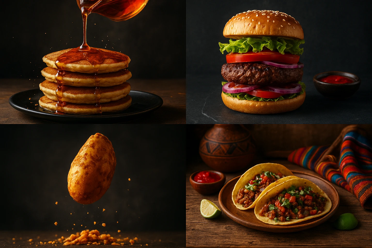
AI tools particularly excel at A/B testing different styling approaches. Marketers can generate bright and airy versions, dark and moody alternatives, and minimalist compositions. All variations come from a single reference photo or description. Testing which style resonates with audiences becomes trivial. Traditional photography requires separate photoshoots for each variation.
Speed represents perhaps the most significant advantage. Traditional shoots required scheduling experts, setting up lighting, and waiting days for editing. Now everything happens in minutes. Seasonal menu updates, daily social media content, and marketing campaigns all become faster and more efficient.
Integration with existing workflows feels seamless for most platforms. Generated images download in standard formats for websites, social media, and print materials. No specialized software or technical expertise required. Styling professionals of the future might spend less time arranging food and more time directing AI.
AI doesn’t replace human creativity and judgment but amplifies them. The best results come from collaboration. Humans curate, select, and refine AI-generated options. Understanding fundamental principles leads to better prompts. AI handles technical execution while humans provide artistic direction.
AI vs. Traditional Food Styling Comparison
| Factor | Traditional Professional | AI Food Styling |
|---|---|---|
| Time Investment | 2-4 weeks scheduling + shooting + editing | Minutes for generation |
| Cost per Image | $150-300+ including photographer and stylist | Credit-based subscription, typically under $10 per image |
| Iteration Speed | Limited reshoot budget, expensive revisions | Unlimited variations, instant regeneration |
| Consistency | Varies by photographer/stylist interpretation | Branded environments ensure perfect consistency |
| Technical Skill Required | Years of training and experience | Minimal learning curve |
| Best For | Hero shots, high-end editorial, brand campaigns | Volume content, testing, routine marketing needs |
For businesses exploring AI food styling, start with a few test images to understand the quality and capabilities. Many restaurants use AI for day-to-day content while still hiring professional photographers for signature hero shots-complementary approaches rather than replacement.
Next steps
Ready to transform your food photography without hiring a professional? Yummify’s AI-powered platform makes professional styling accessible to everyone. Upload a reference photo of your dish or describe it in text. Our advanced AI generates beautifully styled images in minutes. Create branded environments that ensure consistency across all your menu items and social media content. Perfect for restaurants, food bloggers, and ghost kitchens who need professional visuals fast. Try Yummify free today and see the difference AI styling makes for your brand.
FAQ
What does a food stylist do that I can’t learn myself?
Professionals bring years of experience, specialized tools, and deep knowledge of how food behaves under cameras. However, many techniques can be learned and applied at home. These include careful plating, strategic garnishing, steam effects, and prop selection. The difference lies primarily in speed and consistency. Experts achieve professional results quickly through practice. Beginners develop these skills over time. With AI tools like Yummify, you can achieve professional-quality results even while learning.
How much does hiring a professional cost compared to AI alternatives?
Hiring experts typically costs $400-800 per session, plus photographer fees ($150-300 per dish). A complete menu photoshoot can easily cost $3,000-6,000 for 20 dishes. Add 2-4 weeks of scheduling and editing time. AI platforms like Yummify work on credit-based subscriptions. Individual images cost significantly less, often under $10 per image. The math makes AI particularly attractive for high-volume needs.
Can AI food styling really replace professional photography?
AI doesn’t replace professional photography entirely but complements it. For hero shots, brand campaigns, and cookbook covers, traditional photography delivers unmatched quality. A skilled expert provides artistic control that AI cannot match. However, for routine needs like menu photos and social media content, AI offers speed and consistency. Smart businesses use both approaches. AI handles volume and iteration while professionals create signature premium content.
What basic tools do I need for DIY work at home?
Start with essentials: white plates in various sizes, tweezers for precise garnish placement, and small squeeze bottles for sauce application. Add a pastry brush for oiling proteins and good lighting. Natural window light works brilliantly. Include simple props like linen napkins, wood cutting boards, and basic flatware.
Build your collection gradually. Focus on neutral, versatile pieces first. Many effective techniques require nothing more than household items and patience.
How do I make food look fresh in photos when it’s been sitting out?
Reviving tired food is a core technique. Spritz greens with water to restore crisp appearance. Brush proteins with oil to replace lost shine. Use a kitchen torch to warm surfaces and restore color. Reposition wilted garnishes. For beverages, the water-corn syrup spray creates condensation that looks freshly poured. Food looks best immediately after cooking, so plan timing carefully.
What common mistakes should I avoid when styling food for photos?
Most beginners overdo garnishes and sauces. Restraint usually looks more professional than excess. Avoid overcrowding plates. Negative space lets food stand out. Don’t ignore lighting. Even perfectly styled food looks unappealing in bad light. Skip props that don’t relate to the food or setting. Authenticity matters more than decoration. Watch color theory. Clashing colors create visual tension. Cook items slightly less than you would for serving. They’ll continue cooking during photography setup.
How can Yummify help with my food styling needs?
Yummify transforms reference photos or text descriptions into professionally styled food images using advanced AI. Upload a photo of your dish. Receive multiple professionally styled variations in minutes. Create branded environments that ensure perfect consistency across all your imagery. Every taco, burger, or salad shares the same visual identity. Generate unlimited variations for A/B testing without additional photoshoots.
Related posts
15 Creative Food Photography Ideas to Make Your Dishes Stand Out
Discover creative food photography ideas to make your dishes stand out. Learn action shots, deconstructed dishes, unique angles, storytelling, and AI tools for stunning food visuals.
Beyond Burgers: AI Food Styling for Diets and Cuisines
Use AI food styling to create accurate vegan, gluten-free, halal, kosher, and global cuisine photos that convert across delivery apps, QR menus, and social.
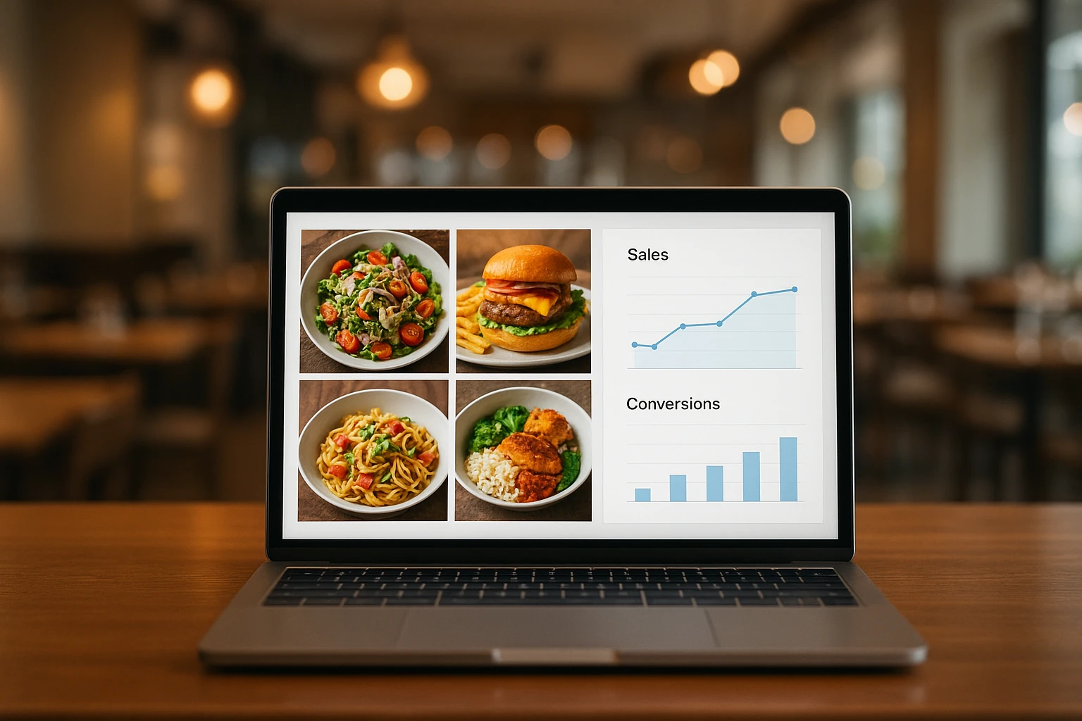
Close the Loop: Tie Food Imagery to Analytics and Sales
Stop guessing which food photos work. Learn a simple workflow to tie Yummify images to analytics, A/B test visuals, and promote only the photos that actually sell.