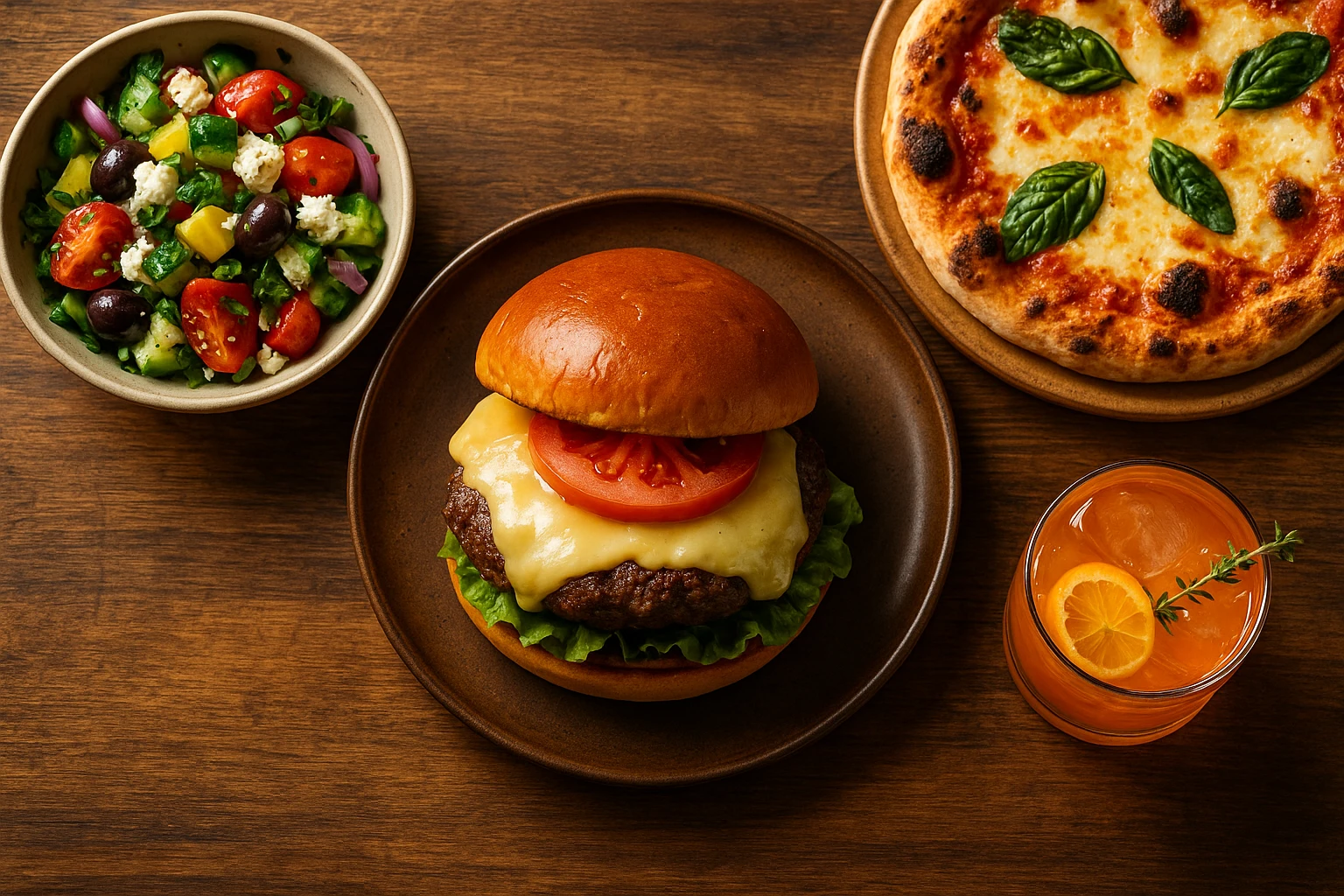
Food Images That Sell: Menu Photo Psychology Guide
Quick navigation:
The Science of Visual Hunger: Why We Eat With Our Eyes
Your brain decides whether to eat something before you ever taste it. Research shows that visual exposure to food triggers hunger responses, even when you’re not actually hungry. This phenomenon is called “visual hunger.” It explains why compelling food images can dramatically increase orders and sales.
The Brain’s Visual Processing Priority
When you see delicious food, your orbitofrontal cortex activates. This is the same region activated by actual eating. Your brain prepares your body for digestion by increasing salivation and releasing hunger hormones. This automatic response bypasses logical thinking and taps directly into primal drives.
For restaurants and food businesses, this means something important. The right restaurant food images create immediate desire, not just information. The challenge is capturing that visual appeal consistently across your menu.
Why Quality Matters More Than Ever
Customers now judge restaurants based on food images before they ever visit. Photos shape how users perceive value and influence buying choices. Low-quality visuals signal low-quality food, regardless of actual taste.
Consider these statistics:
- Restaurants with professional photos see 25-30% higher conversion rates on delivery platforms.
- Menu items with photos are 2-3x more likely to be ordered than text-only items.
- Customers spend 40% more when menus include high-quality visuals.
The Visual Hierarchy of Menu Design
Effective menu design uses visual hunger through strategic placement:
| Placement | Impact | Best For |
|---|---|---|
| Top-right | First eye position | Signature dishes |
| Center | Maximum attention | High-margin items |
| With photos | 2-3x conversion | All premium items |
The science is clear: we eat with our eyes first. Investing in professional photography is a direct investment in sales performance. Whether updating menus, optimizing delivery apps, or creating social content, understanding visual hunger gives you an unfair advantage with food images.
Color Psychology: Palette That Drives Appetite
Color triggers strong emotional responses and affects the body directly. Understanding color psychology gives you control over how customers see your dishes. Food color shapes both appetite and flavor expectations. This makes food photography psychology key to creating food images that drive sales.
The Appetite-Triggering Spectrum
Certain colors activate hunger responses more effectively than others:
-
Red-Increases heart rate and stimulates appetite. Fast food chains use red prominently for this reason. In food images, red draws immediate attention.
-
Orange-Evokes enthusiasm, energy, and comfort. This color is associated with warmth and social dining. Perfect for casual, family-friendly visuals.
-
Yellow-Triggers happiness and grabs attention. This enhances perceived value and stimulates mental activity. Works well for highlighting promotional items.
-
Green-Signals freshness, health, and natural ingredients. This appeals to health-conscious customers. Essential for vegetarian or wellness-focused food images.
-
Blue-Generally suppresses appetite because it’s rare in nature. Use sparingly as a contrast color or for seafood presentations.
Color Temperature and Dining Context
The “temperature” of your food images should match your brand and dining experience.
Warm tones (red, orange, yellow)
- Convey comfort, energy, and excitement
- Ideal for: comfort food, family restaurants, casual dining
- Emotional response: happiness, sociability, indulgence
Cool tones (green, white, neutral)
- Suggest freshness, health, and sophistication
- Ideal for: fine dining, health-focused concepts, premium brands
- Emotional response: calm, purity, refinement
Color Harmony Techniques for Menu Photos
Creating visually appealing menu visuals requires understanding color relationships:
- Complementary colors (opposites on color wheel)
- Red sauce + green basil
- Orange salmon + green asparagus
- High contrast, high impact
- Analogous colors (adjacent on color wheel)
- Yellow corn + orange peppers + red tomatoes
- Harmonious, unified presentation
- Works well for bowl meals and platters
- Monochromatic schemes (variations of one color)
- Different shades of green in a salad.
- Sophisticated, minimalist aesthetic.
- Requires excellent lighting for depth.
Practical Color Optimization Checklist
Use this checklist to optimize colors in food images. Each adjustment enhances visual appeal. The table below shows specific actions and their impact.
| Element | Action | Impact |
|---|---|---|
| Background | Choose complementary color | Makes food pop. |
| Props | Match brand color palette | Reinforces identity. |
| Lighting | Enhance natural food colors | Looks appetizing. |
| Editing | Boost saturation 10-15% | More vibrant without looking fake. |
Case Study: Color Testing Results
A pizza chain A/B tested food images with different color treatments:
- Version A: Natural lighting, minimal color correction
- Version B: Warm overlay, enhanced reds and yellows
Result: Version B increased clicks by 27% and orders by 18%. The warm, saturated colors triggered stronger hunger responses. They conveyed “fresh from the oven” more effectively.
Applying Color Psychology Consistently
Your food images should work as a unified color system that reinforces your brand. Quick-service restaurants use warm, rich colors. Fine dining spots favor cooler palettes that feel more sophisticated.
On delivery apps, customers see many options at once. Your colors must stand out. They should still look tasty. Test different treatments to find what works for your audience.
Lighting and Mood: Setting the Stage for Sales
Lighting transforms food images from dull to irresistible. It defines texture and creates depth. It also sets the emotional tone. Good lighting makes customers feel hungry, not just informed.
The Three Essential Lighting Types
Natural Light
- Characteristics: Soft, diffused, authentic feel
- Best for: Casual dining, brunch concepts, health-focused brands
- Implementation: Shoot near windows during daylight hours. Use reflectors to soften shadows.
- Effect: Conveys freshness and honesty
Softbox/Studio Light
- Characteristics: Controlled, consistent, professional polish
- Best for: Chains, delivery apps, menu consistency
- Implementation: Diffused artificial light from above or slightly behind food
- Effect: Creates quality food images. This lighting builds trust with viewers.
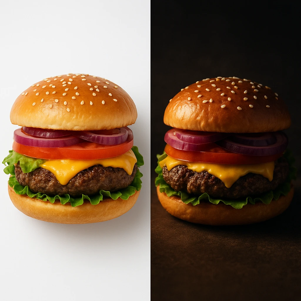
Dramatic/Moody Light
- Characteristics: Deep shadows with strong contrast. Has a spotlight effect.
- Best for: Premium dishes, steakhouse concepts, and late-night dining
- Implementation: Single focused light source with minimal fill
- Effect: Creates luxury and exclusivity in food images
Direction Matters: How Light Angle Affects Perception
The angle of your light source dramatically changes how food appears in photos:
| Light Direction | Effect | Best For |
|---|---|---|
| Backlighting | Creates glow and translucency | Beverages, thin foods |
| Sidelight | Enhances texture and depth | Breads, grilled items |
| Top-lighting | Flattens but shows true colors | Pizza, flat presentations |
| 45-degree angle | Balanced texture and color | Most dishes |
Lighting Techniques That Sell
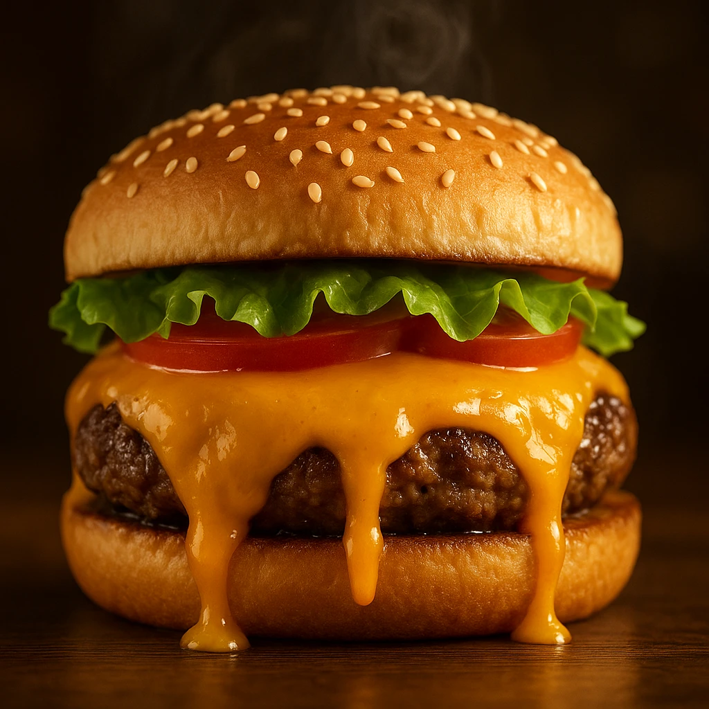
1. The Hero Glow Place your light behind and above the dish. This creates a halo effect. Liquids, sauces, and glazes will glisten. This technique makes food images pop for cocktails, soups, and glazed meats.
2. Texture Emphasis Use side lighting to add shadows that show texture. Crispy food looks crunchier. Bread looks more artisanal. Light and shadow together signal quality.
3. Color Accuracy Proper white balance keeps food looking natural. Yellow light makes food look greasy. Blue light makes it look old. Use neutral light to show true colors.
Mood Matching: Lighting for Your Brand
Your lighting should align with your restaurant’s personality and price point:
Casual/QSR: Bright, even lighting communicates value and transparency. Avoid heavy shadows that hide details customers want to see.
Fast-Casual: Natural light with slight warmth works best. This suggests fresh ingredients without feeling precious.
Fine Dining: More dramatic, controlled lighting. Shadows create depth and suggest exclusivity. Light guides the eye to specific elements.
Ghost Kitchens/Virtual Brands: Use consistent studio lighting for all food images. Customers can’t visit physical locations. Your visuals create the only brand impression.
Common Lighting Mistakes That Kill Appetite
- Mixed color temperatures-Combining daylight (blue) with indoor light (orange) creates unappetizing color casts
- Harsh direct flash-Flattens texture and creates hotspots that make food look plastic
- Insufficient light-Forces high ISO, adding grain that reduces perceived quality
- Overexposure-Blows out highlights in sauces, garnishes, and glazing
- Wrong time of day-Strong midday sun creates unflattering shadows
Quick Lighting Setup Guide
- Choose your main light source (window, softbox, or combination)
- Position light at 45-degree angle to food
- Add fill light or reflector to soften shadows if needed
- Adjust white balance to neutral
- Test shot and check for: realistic colors, visible texture, no harsh shadows
The right lighting makes customers hungrier. When food images look properly lit, they show freshness, quality, and care. That perception drives orders and revenue.
Portion Perception and Composition Tricks
How you frame food images affects perceived value. The same portion can look big or small based on presentation. Master these principles to boost perceived value without larger portions.
The Architecture of Appetizing Composition
Rule of Thirds Placement Place your main dish at one-third points in the frame, not dead center. This adds visual tension and makes food images more engaging. Pros use this to guide the viewer’s eye.
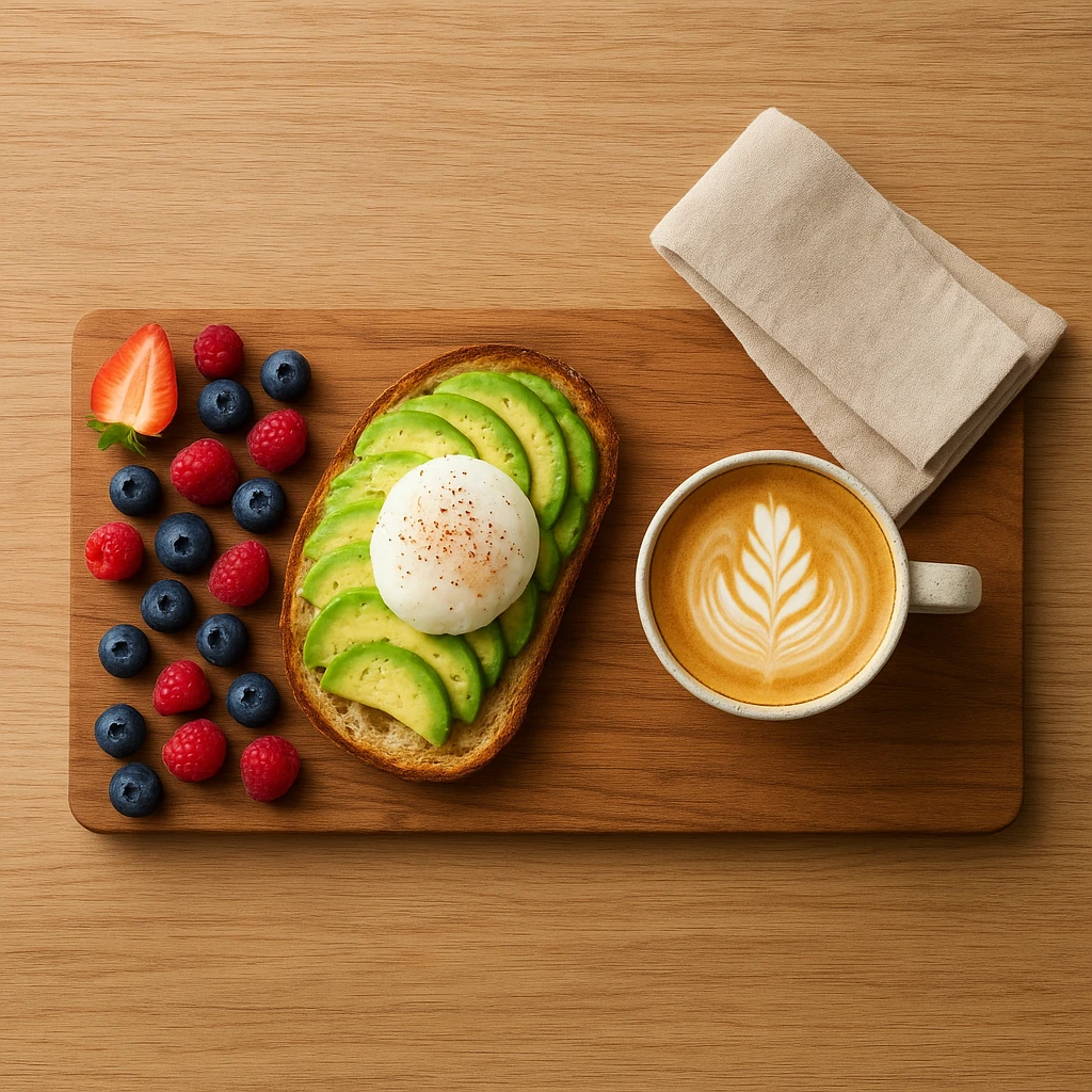
Negative Space for Breathing Room Don’t fill every pixel with food. Empty space creates a premium feel. Show table surface, plate edges, or simple backgrounds. This signals confidence and leaves room for text in marketing.
Layering and Depth Stack elements instead of laying them flat. Burgers should show layers. Parfaits need visible strata. Bowls benefit from toppings on top. This depth signals abundance and care in food images. It makes photos more memorable.
Portion Size Perception Strategies
Use these techniques to maximize perceived value. The table below explains how each technique affects perception.
| Technique | How It Works | Impact on Perception |
|---|---|---|
| Larger plate, centered food | Shows plate edges | Appears premium. |
| Smaller plate, edges covered | No visible plate space | Looks abundant. |
| Vertical stacking | Creates height | Communicates value. |
| Sauce drizzle/spread | Adds visual interest | Suggests richness. |
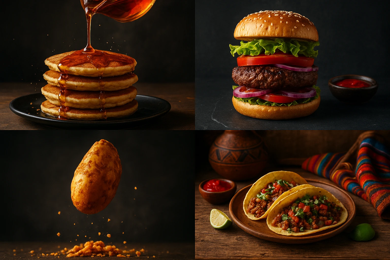
Camera Angle Psychology
The angle you choose changes how customers perceive your menu visuals:
45-Degree Angle (The Sweet Spot)
- Shows both top surface and side profile
- Reveals layers, texture, and thickness
- Most versatile and universally appealing
- Works for: burgers, sandwiches, stacked dishes
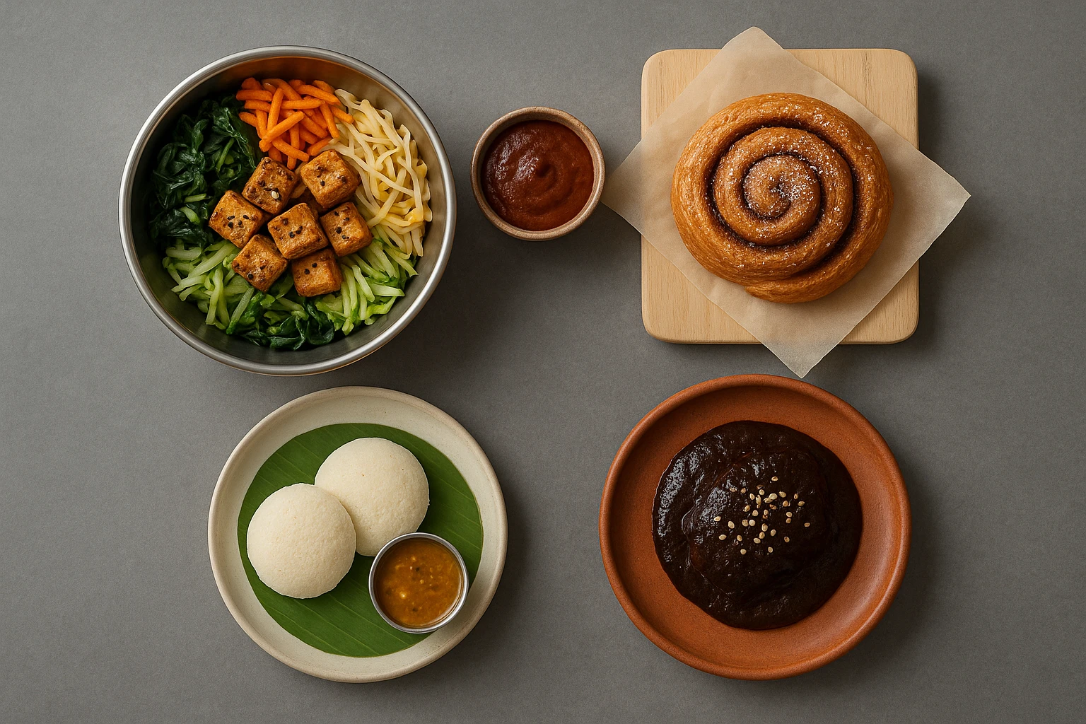
Overhead/Flat Lay
- Shows entire composition at once
- Modern, Instagram-friendly aesthetic
- Works well for: bowls, platters, spreads
- Can make portions look smaller if not careful
Eye-Level/Side View
- Emphasizes height and layering
- Creates drama and presence
- Works for: tall burgers, stacked items, beverages
- Makes food look larger and more substantial
Props and Context That Add Value
Strategic prop placement adds perceived value without changing portion size:
- Utensils-fork halfway through, spoon mid-scoop suggests active enjoyment
- Ingredients-scattered garnish elements reinforce freshness and abundance
- Napkins/linens-adds sophistication and suggests sit-down experience
- Beverages-complete meal perception increases order value
Scale and Reference Points
Include familiar elements that help customers judge portion size:
- Standard dining utensils
- Human hand holding item (for handheld foods)
- Typical plate or bowl sizes
- Beverage glass for proportion
Food images need reference points so customers can judge value. Clear scale boosts ordering confidence.
Composition Traps to Avoid
- Cluttered compositions-too many competing elements create visual confusion
- Dead center placement-feels static and unprofessional
- Wrong angle for the dish-tall food shot from overhead looks flat
- Inconsistent styling-mismatched props undermine brand credibility
- No clear focal point. The eye doesn’t know where to land.
Quick Composition Checklist
Before finalizing your shots, verify these elements:
- [ ] Main dish positioned using rule of thirds
- [ ] Appropriate camera angle for food type
- [ ] Negative space provides breathing room
- [ ] Scale reference included (utensils, plate edges)
- [ ] Props support rather than distract from food
- [ ] Single clear focal point guides the eye
Good composition signals quality, value, and care in menu food images. This leads to higher order values and more confident purchasing decisions.
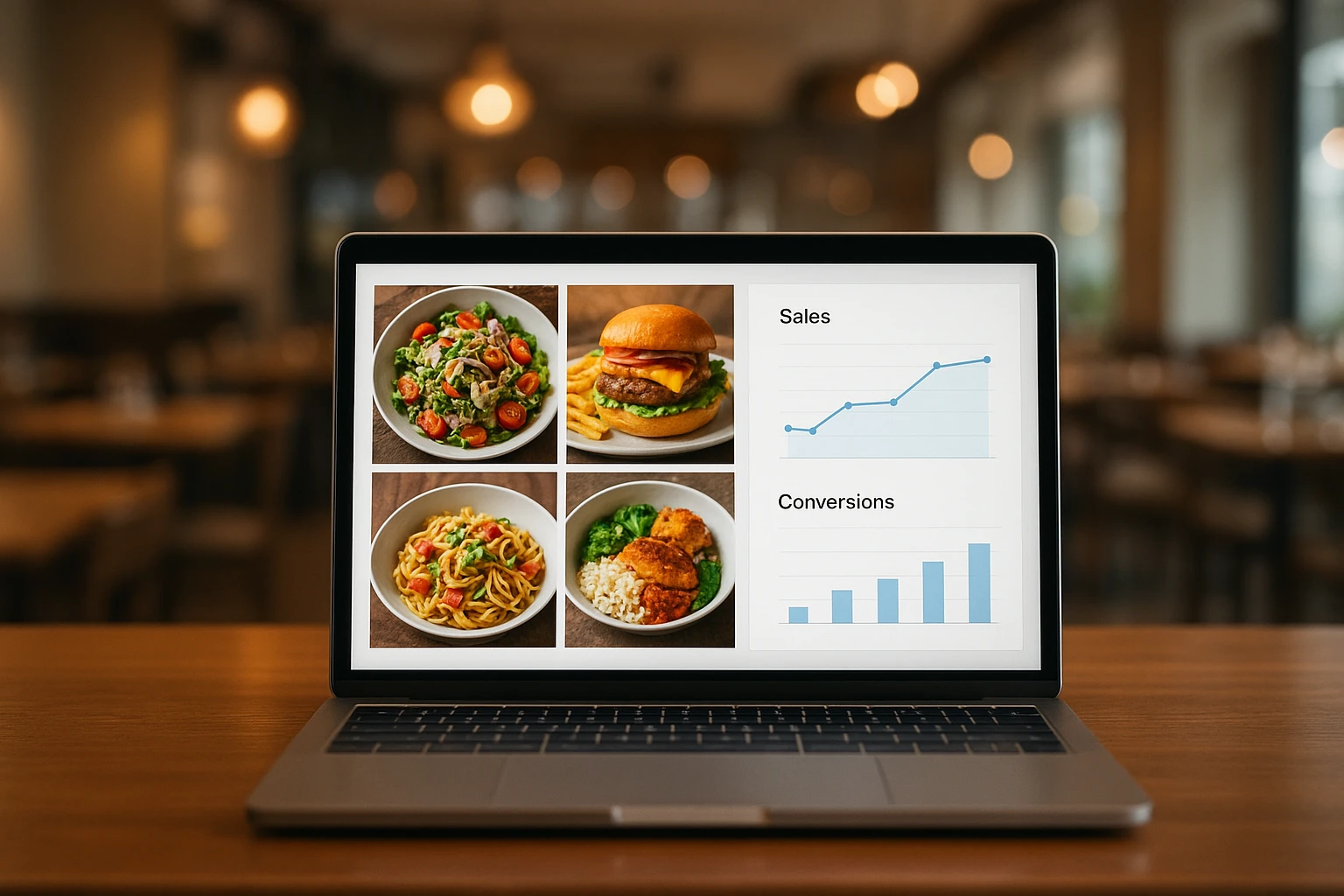
A/B Testing Strategies for Menu Optimization
Don’t pick food images by gut feeling. Use data instead. A/B testing shows what drives clicks, orders, and revenue. This approach separates guesses from facts and improves results over time.
What to Test in Your Menu Visuals
Visual Style Variations Test different photographic treatments of the same dish:
- Bright and airy vs. dark and moody
- Overhead flat lay vs. 45-degree angle
- Minimal styling vs. elaborate garnishing
- Different background colors and textures
Composition Experiments Compare how framing affects performance:
- Close-up texture shots vs. full dish visible
- Single item vs. combo with sides
- Plated presentation vs. packaging for delivery
Context and Presentation Test different ways of showing your dishes:
- On the plate vs. being held/cut
- With human element (hands, face) vs. without
- Restaurant setting vs. studio background
The A/B Testing Process
Follow this systematic approach to test food images:
- Define your hypothesis-“warmer lighting will increase clicks by 15%”
- Create variations-generate 2-3 versions using different approaches
- Run simultaneous tests-show each version to equal audience segments
- Measure key metrics-track click-through, conversion, and order value
- Analyze results-determine statistical significance
- Implement winner-roll out winning version to all traffic
- Document learnings-build knowledge base for future tests
Key Metrics to Track
Focus on these metrics to understand performance. Each metric reveals different insights. Use the table below to track what matters most.
| Metric | What It Reveals | How to Measure |
|---|---|---|
| Click-through rate | Initial appeal strength | Link clicks divided by impressions. |
| Conversion rate | Purchase decision | Orders divided by clicks. |
| Average order value | Perceived quality impact | Total revenue divided by orders. |
| Return rate | Expectation alignment | Repeat orders divided by total orders. |
Testing Prioritization Framework
Focus testing efforts where they matter most:
High Impact, High Frequency
- Test first: Hero items, signature dishes, delivery app thumbnails
- These items generate the most views and orders
- Small improvements compound quickly
High Impact, Low Frequency
- Test second: Seasonal specials, limited-time offers
- Less total views but critical for promotions
- Test before major campaigns
Low Impact, Any Frequency
- Test last: Low-margin sides, beverages (unless signature items)
- Minimal revenue impact
- Update only when major redesign happens
Common Testing Pitfalls
Avoid these mistakes when testing food images:
- Testing too many variables-can’t determine which change caused the difference
- Sample size too small-results aren’t statistically valid
- Testing during anomalies-holidays and events skew data
- Stopping too early-premature conclusions from incomplete data
- Ignoring seasonal factors-summer photos may not perform in winter
- Not documenting results-you repeat mistakes or forget what worked
Real-World Testing Results
Case Study: Burger Chain Photo Redesign
- Tested: Overhead flat lay vs. 45-degree angle
- Result: 45-degree angle increased clicks by 23%
- Reasoning: Better showed burger height and layering
Case Study: Salad Delivery Images
- Tested: Bright overhead vs. moody side lighting
- Result: Bright overhead increased conversion by 31%
- Reasoning: Health-conscious customers preferred fresh, light aesthetic
Case Study: Pizza Chain Background Test
- Tested: Restaurant background vs. solid color
- Result: Restaurant background decreased clicks by 12%.
- Reasoning: Distracted from food. Looked like stock photo.
Tools for Effective Testing
Delivery Platforms
- Uber Eats, DoorDash, and Grubhub allow image uploads and track performance
- Built-in audience for testing delivery-optimized food images
Social Media Ads
- Facebook and Instagram ad platforms provide detailed analytics
- Cost-effective way to test before major website menu updates
Email Marketing
- Test different visual content in promotional emails
- Track open and click rates to determine winners
Building Your Testing Culture
The most successful restaurants treat food images as ongoing optimization, not one-time projects. Follow this rhythm:
- Monthly testing of 1-2 key items
- Quarterly review of all menu visuals
- Annual full visual refresh based on data
- Continuous documentation of learnings
This approach compounds over time. Each test teaches you what works for your audience. In 6-12 months, you’ll have a data-backed strategy that beats competitors who rely on guessing.
Next steps
Ready to create menu visuals that sell? Yummify generates pro-quality dish photography in minutes. No studio needed. Start with a photo or text prompt. Apply your brand style. Produce dozens of versions for testing. Update your whole menu in an afternoon. Keep visual content consistent across all channels. Try Yummify
FAQ
What makes menu photos more likely to convert customers?
Winning food images combine appetite appeal with psychology. Use warm colors like red and orange to boost hunger. Light dishes to show texture and freshness. Frame shots to show portion size clearly. Match your brand: bright for family dining, moody for premium spots. Add scale references like utensils or plate edges. Test different approaches to see what works.
How important is professional photography for restaurant menus?
Pro food images directly impact revenue. High-quality photos boost delivery conversions by 25-30%. Items with photos get ordered 2-3x more than text-only items. Customers judge quality by visuals first. Bad photos signal bad food. In competitive markets, great food images aren’t optional.
What colors work best for appetizing menu photos?
Warm colors stimulate appetite. Red boosts heart rate and hunger. Orange evokes comfort. Yellow grabs attention. These work great for comfort food. Green signals freshness and health. Blue suppresses appetite-use sparingly. Match colors to your brand: warm for fast-casual, cool tones for fine dining.
Should I use the same photos across all platforms?
Consistency builds brand recognition, but each platform needs tweaks. Keep styling consistent so customers recognize your dishes. Delivery apps need bright, clear thumbnails. Websites can use dramatic shots. Social media benefits from lifestyle context. Create core food images first, then adapt for each channel.
How often should I update my restaurant menu photos?
Review dish photography quarterly. Do major updates annually or by season. Test 1-2 items monthly to keep improving. Update seasonal menus with matching visuals. Winter comfort shots don’t work in summer. Refresh items with dropping conversions first.
What’s the difference between food images for delivery apps vs. dine-in menus?
Delivery app visuals compete in small thumbnails. They need strong contrast, vibrant colors, and instant appeal. Show dishes clearly with minimal props. Add packaging context when relevant. Dine-in menu photos can be more artistic since customers already committed to your restaurant. Delivery food images prioritize clarity. Dine-in shots tell your brand story.
Can AI-generated food images compete with professional photography?
AI-generated food images excel at speed and consistency. They’re great for daily social posts, menu testing, and multi-location brands. They cost far less than traditional shoots and allow rapid A/B testing. For flagship hero shots, pros still deliver top quality. Use AI for volume and photographers for signature pieces.
Related posts
15 Creative Food Photography Ideas to Make Your Dishes Stand Out
Discover creative food photography ideas to make your dishes stand out. Learn action shots, deconstructed dishes, unique angles, storytelling, and AI tools for stunning food visuals.
Beyond Burgers: AI Food Styling for Diets and Cuisines
Use AI food styling to create accurate vegan, gluten-free, halal, kosher, and global cuisine photos that convert across delivery apps, QR menus, and social.
Close the Loop: Tie Food Imagery to Analytics and Sales
Stop guessing which food photos work. Learn a simple workflow to tie Yummify images to analytics, A/B test visuals, and promote only the photos that actually sell.